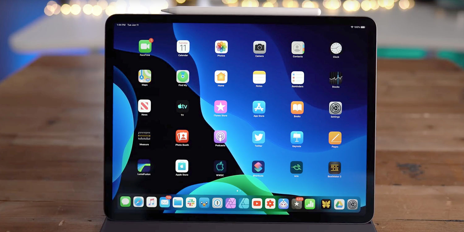
Comment: iPad icon spacing option in latest beta is a huge missed opportunity<div class="feat-image">

</div>
<p>Apple yesterday released the <a href="
https://9to5mac.com/2019/07/29/ios-13-beta-5-changes/" target="_blank" rel="noopener noreferrer">fifth developer beta[/url] of iPadOS 13, and it included a Home screen improvement: an option for adjusting iPad icon spacing.</p>
<p>In iPadOS 13, you can now adjust Home screen icon density. This means you can pick between a 4×5 grid of apps, or a 6×5 grid of apps.</p>
<p>Any improvement here is welcome, of course, but even a 6×5 icon grid is a tremendous waste of space on a 12.9-inch iPad. Offering an option to change it, but doing so in the most limited way imaginable, is a huge missed opportunity …</p>
<p> <a href="
https://9to5mac.com/2019/07/30/ipad-icon-spacing/#more-602994" class="more-link">more…[/url]</p>
<p>The post <a rel="nofollow" href="
https://9to5mac.com/2019/07/30/ipad-icon-spacing/">Comment: iPad icon spacing option in latest beta is a huge missed opportunity[/url] appeared first on <a rel="nofollow" href="
https://9to5mac.com">9to5Mac[/url].</p><div class="feedflare">
<img src="[url]http://feeds.feedburner.com/~ff/9To5Mac-MacAllDay?i=mha23WAV1LU:khE816puoGY:D7DqB2pKExk" border="0"></img>[/url]
</div><img src="
http://feeds.feedburner.com/~r/9To5Mac-MacAllDay/~4/mha23WAV1LU" height="1" width="1" alt=""/>
Source:
Comment: iPad icon spacing option in latest beta is a huge missed opportunity