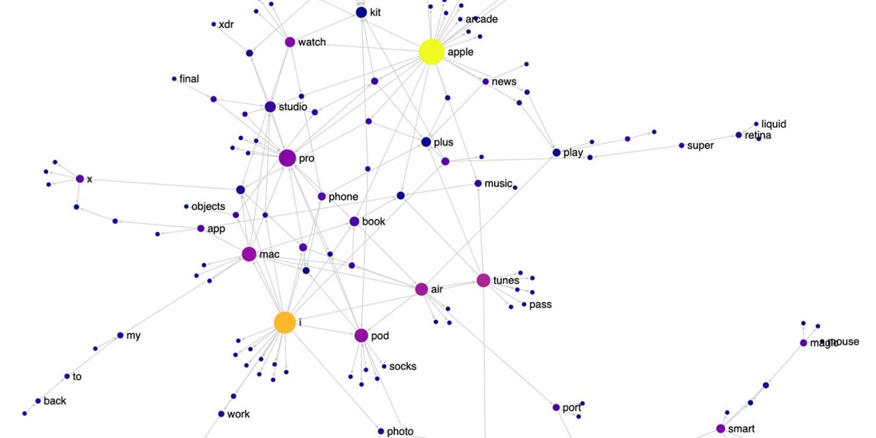
Apple product names illustrated by cool interactive visualization<div class="feat-image">

</div>
<p>Some <a href="
https://9to5mac.com/guides/aapl/" target="_blank" rel="noreferrer noopener">Apple[/url] product names are simple and timeless – like <a href="
https://9to5mac.com/guides/macbook-air/" target="_blank" rel="noreferrer noopener">MacBook Air[/url] or <a href="
https://9to5mac.com/guides/airpods/" target="_blank" rel="noreferrer noopener">AirPods[/url] – while others are, uh, less so. I’m looking at you, iPhone 14 Pro Max. </p>
<p>If you want to get a feel for how Apple names its products, data visualization researcher Nicolas Kruchten has put together a cool interactive map, showing how Apple mixes and matches different core elements in its product naming … </p>
<p> <a href="
https://9to5mac.com/2022/12/22/apple-product-names/#more-854626" class="more-link">more�
https://9to5mac.com/2022/12/22/apple-product-names/">Apple product names illustrated by cool interactive visualization[/url] appeared first on <a rel="nofollow" href="
https://9to5mac.com">9to5Mac[/url].</p>
Source:
Apple product names illustrated by cool interactive visualization