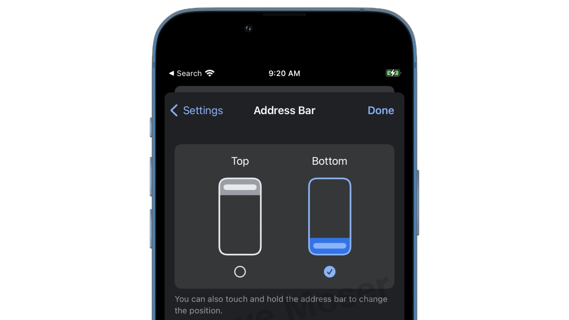
Google's Chrome Browser Testing Bottom-Placed Address Bar on iOSGoogle's Chrome browser for iOS is testing an option for users to shift the address bar to the bottom of the screen, two years after Apple’s Safari made the same change.

The move, spotted by
MacRumors contributor
Steve Moser, is currently in beta testing in the Testflight version of the app. Currently the change is optional, enabling users to set the URL bar to the top or bottom by pressing and holding the bar to bring up a switch, or by changing the location via Settings -> Address Bar.
Apple in its iOS 15 beta testing phase introduced a redesigned Safari experience that moved the URL bar and tab interface to the bottom of the iPhone, a decision that initially proved controversial with iPhone users.
Locating the bar at the bottom of the interface made it easier to browse with one hand, but not everyone was happy. After listening to feedback, Apple
added a toggle to show the address bar at the top of the iPhone rather than the bottom, for users who preferred the more iOS 14-like experience.
It's not clear whether Chrome will roll out the change to all users – Google tried a similar change in Chrome for Android in 2017, then subsequently removed the feature. However, with iPhone screens historically getting iteratively bigger, many will likely welcome the change, should it stick.
<div class="linkback">Tag:
Google Chrome</div>
This article, "
Google's Chrome Browser Testing Bottom-Placed Address Bar on iOS" first appeared on
MacRumors.comDiscuss this article in our forums
Source:
Google's Chrome Browser Testing Bottom-Placed Address Bar on iOS