iOS 9 first look: A smarter, smoother experience for iPhone and iPad<div class="field field-name-body field-type-text-with-summary field-label-hidden"><div class="field-items"><div class="field-item even" property="content:encoded"><p><a href='
http://www.imore.com/ios-9-first-look' title="iOS 9 first look: A smarter, smoother experience for iPhone and iPad"><img src='
http://www.imore.com/sites/imore.com/files/styles/large_wm_blw/public/field/image/2015/07/ios-9-first-look-hero.jpg?itok=QVfI7sG9' />[/url]</p> <p class="intro">iOS 9 is Apple's next-generation operating system for iPhone and iPad, and with it comes both polish and intelligence</p> <p>After the radical redesign of iOS 7, which gave us a flatter, more physical experience, and the functional revolution of iOS 8, which extended and continued that experience beyond discreet apps and devices,
iOS 9 promises us just two simple, profound things—to polish everything that's come before, and to begin the next journey forward.</p> <p>Apple's grand plan for iOS 9 breaks down as follows: To add intelligence throughout the system, to improve popular apps, to take iPad productivity to the next level, and to elevate the foundations of the platform.</p> <p>More specifically, Apple is making Siri and Search broader and more proactive, expanding Apple Pay, significantly improving Notes, adding transit to Maps, launching an all-new News app and service, enhancing the Quicktype keyboard, bring multi-app multitasking to the iPad, amping up performance, extending battery life, tightening up security and privacy, and making the update process much more efficient.</p> <p>I've spent the last month testing the iOS 9 developer beta, and the last few days trying out the public beta. So, how does it look?</p> <!--break--> <h2>Siri & Search</h2> <p>
Siri is Apple's virtual personal assistant. It launched as a beta in 2011 and has been improved and expanded every year as part of iOS feature releases, and continuously as part of server-side updates. Most recently that's included new
Apple Music commands, and a new engine that Apple says has made Siri 40% faster and more accurate. When you're handling a billion requests a day, and customers depend on those requests, you can never be too fast or too reliable.</p> <p><a href='
http://www.imore.com/ios-9-first-look' title="iOS 9 first look: A smarter, smoother experience for iPhone and iPad"><img src='
http://www.imore.com/sites/imore.com/files/styles/large/public/field/image/2015/07/ios-9-first-look-siri-ui%2Cjpg.jpg?itok=e7Gre7yT' />[/url]</p> <p>With iOS 9, Siri is getting a new interface that looks like
Siri on the Apple Watch, including a side-to-side pulse like something out of Knight Rider or Battlestar Galactica. It's dynamic but it's also colorful and fun.</p> <h3><strike>Spotlight</strike> Search</h3> <p>In an effort to make voice and text better integrated and more consistent, Siri is largely subsuming Spotlight. Now referred to simply as Search, it lets you can type when you can't talk.</p> <p>That means natural language input—asking questions the way a human would—is now available with the keyboard as well as the microphone, and Search has access to information that used to be reserved only for Siri, including sports, stocks, weather, Apple help, YouTube, Vimeo, iCloud drive, Health, holidays, calculations and conversions, and more. There's even a way for developers to index their content for Search in iOS 9, so we'll even be able to find things in App Store apps.</p> <p>Including, apparently, a tasty recipe for Canadian poutine...</p> <h3>Deep and back links</h3> <p>Currently, most apps are opaque to the rest of iOS. There's the ability, with URL schemes, to link to some specific parts of some App Store apps, but there's nothing approaching consistency or ubiquity. Worse, once you leave an app, there's no easy way to go back. At best you can double click the Home button and use the fast app switcher to return from whence you came.</p> <div class="media-gallery-flat"><div data-title="" data-big="/sites/imore.com/files/styles/xlarge/public/field/image/2015/06/wwdc-2015-ios-9-siri-app-search-yummly.jpeg?itok=QLGsS4_0" class="flat-img " style="background-image:url(/sites/imore.com/files/styles/w800h450crop/public/field/image/2015/06/wwdc-2015-ios-9-siri-app-search-yummly.jpeg?itok=QLGsS4_0);"></div><div data-title="" data-big="/sites/imore.com/files/styles/xlarge/public/field/image/2015/06/wwdc-2015-ios-9-back-linking.jpeg?itok=dQAHCSD0" class="flat-img " style="background-image:url(/sites/imore.com/files/styles/w800h450crop/public/field/image/2015/06/wwdc-2015-ios-9-back-linking.jpeg?itok=dQAHCSD0);"></div></div> <!--/media-gallery-flat--> <p>Deep links and back links in iOS 9 aim to change that by making apps more transparent to the system in general and Search in specific, and by making getting back as easy as getting there.</p> <p>For example, with that tasty recipe for Canadian poutine, instead of a result or link launching the cooking app, it takes you to the exact screen that has the recipe. Then, on that screen, at the very top left, an arrow and bit of text identifying where you came from makes it incredibly easy to go right back.</p> <p>It even works with the web, if developers use web markup to tie their apps and websites together. That means our days of tapping a Twitter link and going to the mobile version of twiiter.com—yes, like animals—are almost behind us. Soon we'll tap that link and open the same exact tweet in Twitter.app instead.</p> <p>Apple will only let official apps register for deep web links, and there's still no way to re-set default apps. That makes them secure—no one should be able to intercept them or spoof them to steal data or try to trick you—but it also makes deep links locked to the owner of the website. So, if you prefer Twitterrific or Tweetbot for your Twitter links, you're out of luck.</p> <p>Thanks, in part, to those limitation, however, it's lightning fast. Screens feel like they're sliding in and out like the automatic doors on Star Trek. And apps seem as though they're embedded inside each other.</p> <p>Overall, it's an
incredible navigational improvement.</p> <h3>Search Screens and Siri Suggestions</h3> <p>Back before iOS 7, when Apple made Spotlight accessible from any Home screen simply by swiping down, there was a dedicated search screen available by swiping to the left of Home. iOS 9 brings it back, but with significant improvements.</p> <div class="media-gallery-flat"><div data-title="" data-big="/sites/imore.com/files/styles/xlarge/public/field/image/2015/06/wwdc-2015-ios-9-siri-suggested-page.jpeg?itok=ONsr0Ce_" class="flat-img " style="background-image:url(/sites/imore.com/files/styles/w800h450crop/public/field/image/2015/06/wwdc-2015-ios-9-siri-suggested-page.jpeg?itok=ONsr0Ce_);"></div><div data-title="" data-big="/sites/imore.com/files/styles/xlarge/public/field/image/2015/06/wwdc-2015-ios-9-siri-suggested-contact-options.jpeg?itok=MCsfXSV9" class="flat-img " style="background-image:url(/sites/imore.com/files/styles/w800h450crop/public/field/image/2015/06/wwdc-2015-ios-9-siri-suggested-contact-options.jpeg?itok=MCsfXSV9);"></div></div> <!--/media-gallery-flat--> <p>There's still a search box top and center, now with a microphone button so you can use voice to access Search absent Siri, if you really want to. More importantly, instead of the rest of the screen being empty, iOS is filling it up with Siri Suggestions.</p> <p>Siri Suggestions are based on things you've recently done, things you typically do, and things the system thinks you might want to do based on time, place, or related activities.</p> <p>The first row is Contacts. So, for example, if you just messaged your friend, their icon will be there so you'll be able to message them again if you want to. If you typically call your significant other before you leave work every day at 5pm, your significant other's icon might be there as well, ready and waiting for you to make the call. If you have an appointment with someone in your calendar, their icon will be there in case you need to reach out to them.</p> <p>This replaces the Favorite and Recent Contacts from the iOS 8 fast app switcher screen, and while they're no longer separated into those categories, they offer the same functionality. Tap one and you get options to call, message, FaceTime, or to go to the contact card for even more options.</p> <p>The second row is Apps. So, if you typically check Facebook first thing every morning, Facebook could show up there as a convenience. If recently downloaded Letterpress but haven't tried it yet, Letterpress could show up there as a reminder.</p> <p>This doesn't replace suggested apps on the Lock screen but rather enhances them. Now, when continuity or location-based suggestions aren't populating the bottom left corner, you might get suggested app there instead.</p> <p>The third row is Nearby. These are places of interested populated based on time of day and location. For example, in the morning you might see breakfast spots or coffee shops. When you typically drive home from work, you could see a gas station or, if you use public transportation, a train station.</p> <p>The last row is News. It starts off with major stories, breaking news, and popular articles, based on your location, and then starts curating based on what you've shown an interest in by tapping.</p> <p>You can choose to show more in any section, which effectively doubles the number of suggestions. There's no way, however, to turn off any sections that don't interest to you, or to like or dislike suggestions to bias the recommendations. Also, while Search can provide results more like Siri, it can't take commands like Siri. So no typing "message Georgia I'll be late" or "shuffle Nine Inch Nails".</p> <p>You can, however, access a wealth of on-device and online content with just a few keystrokes, and that makes Search significantly more powerful and useful.</p> <h3>Siri for Photos</h3> <p>Siri can now search for and find photos on the iPhone and iPad. You can ask for photos based on dates, locations, and albums. If you've set up Faces in
Photos for OS X, Siri can also find pictures of the people you know (if not, you'll get photos pulled from Bing).</p> <p>So, for example, you can tell Siri to "Show me photos from San Francisco in June" or "show me concert night photos with Dalrymple". It's a terrific way to quickly and easily find photos, and far beyond what's possible without Siri.</p> <h3>This and that</h3> <p>Siri's contextual awareness now goes beyond sequential inference—remembering your previous request so it can use it as a filter for your next one. Now Siri is also aware of what you're doing when you ask a question. That means, if you see something in an app like Messages, Mail, Safari, Notes, etc, you'll be able to say "Remind me about
this" and Siri will set a Reminder and link it to the content you were referencing at the time.</p> <p>So, for example, if you get sent a picture of an iPhone case and want to remember to look it up later, you can say "remind me about this a 3pm", and a reminder will be set with the picture attached and a link back to the message. Likewise, if a new podcast episode drops while you're busy, you can say "Remind me about this when I leave home" and you'll be able to enjoy it during your next commute.</p> <h3>Proactive</h3> <p>With iOS 9, Siri is becoming more "proactive". What Apple means by that is something akin to prescience—when a virtual assistant provides information before you even ask for it. It's a controversial feature because, as typically implemented, it requires you to upload significant amounts of personal, private information to the cloud.</p> <div class="media-gallery-flat"><div data-title="" data-big="/sites/imore.com/files/styles/xlarge/public/field/image/2015/07/ios-9-first-look-siri-proactive-traffic.jpg?itok=8On09Xki" class="flat-img " style="background-image:url(/sites/imore.com/files/styles/w800h450crop/public/field/image/2015/07/ios-9-first-look-siri-proactive-traffic.jpg?itok=8On09Xki);"></div><div data-title="" data-big="/sites/imore.com/files/styles/xlarge/public/field/image/2015/07/ios-9-first-look-siri-proactive-caller.jpeg?itok=IswcyUrA" class="flat-img " style="background-image:url(/sites/imore.com/files/styles/w800h450crop/public/field/image/2015/07/ios-9-first-look-siri-proactive-caller.jpeg?itok=IswcyUrA);"></div></div> <!--/media-gallery-flat--> <p>Apple's doing it differently, however. Apple isn't bringing your data up to the cloud, they're bringing the service down to your iPhone or iPad. That way your data stays yours, and it's not shared with Apple or anyone else. It doesn't allow for everything every competing service offers, but it does allow for significantly better privacy.</p> <p>With proactive, for example, when you plug in your headphones Siri can anticipate you're going to go jogging and bring up Now Playing with your usual playlist. When you get into your car, Siri can anticipate you want to continue listening to your audiobook. When you create a calendar event or mail message with a common subject, Siri can anticipate the usual people you invite or copy. When you receive an invitation, Siri can automatically add it to your calendar. If traffic changes, Siri can alert you to leave earlier and provide up-to-date driving directions. When an unknown call comes in, Siri can check your email for occurrences of that number and suggest who it might be.</p> <p>It's a first step, and a cautious one, but also a valuable alternative.</p> <h2>Apple Pay + Wallet</h2> <p>Passbook on the iPhone began humbly enough, as a way to collect together all your boarding passes, gift cards, coupons, and tickets, all in one place. You could scan codes, but not much more. Then, last year, Apple added personal credit and debit cards in the U.S., and support for near-field communications (NFC). In other words, Apple Pay came to Passbook.</p> <p><a href='
http://www.imore.com/ios-9-first-look' title="iOS 9 first look: A smarter, smoother experience for iPhone and iPad"><img src='
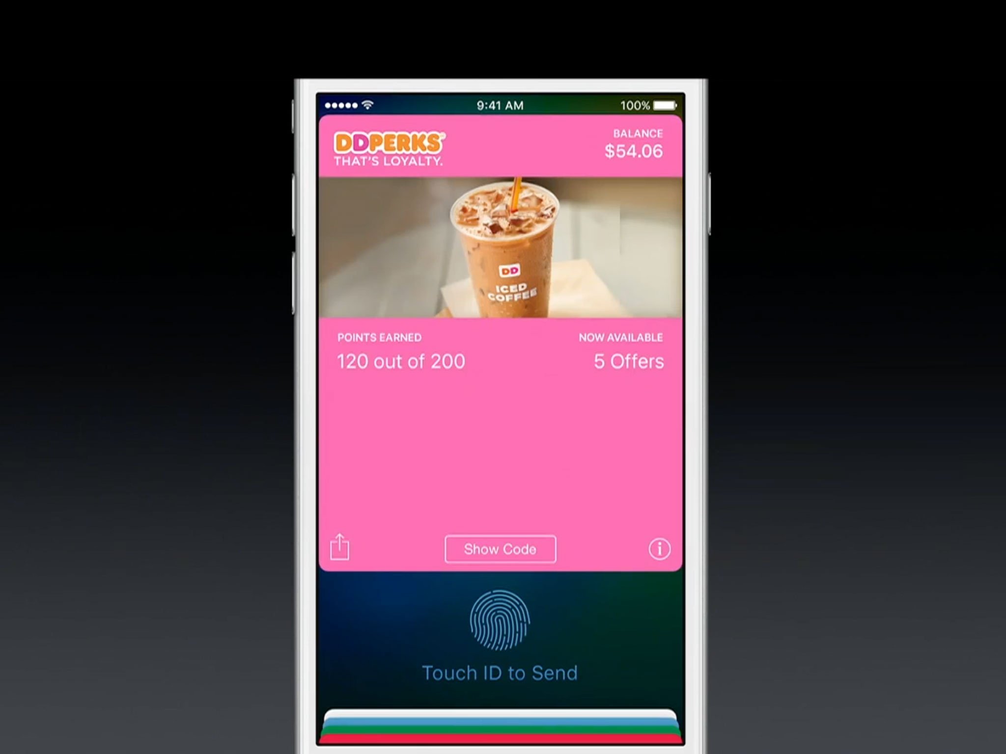
?itok=u4x0ANpg' />[/url]</p> <p>This year Apple is adding store and loyalty cards and, in recognition of its expanded role and functionality, renaming Passbook to Wallet.</p> <h3>Store and loyalty cards</h3> <p>Store cards are like credit or debit cards but issued through large retailers. They typically offer you store-specific rewards and benefits for using them. Apple has mentioned Kohl's Charge, JCPenney Credit Card, and BJ's Wholesale Club as launch partners, with more to come.</p> <div class="media-gallery-flat"><div data-title="" data-big="/sites/imore.com/files/styles/xlarge/public/field/image/2015/06/wwdc-2015-iso-9-apple-pay-store-cards.jpeg?itok=FrQp9tt4" class="flat-img " style="background-image:url(/sites/imore.com/files/styles/w800h450crop/public/field/image/2015/06/wwdc-2015-iso-9-apple-pay-store-cards.jpeg?itok=FrQp9tt4);"></div><div data-title="" data-big="/sites/imore.com/files/styles/xlarge/public/field/image/2015/06/wwdc-2015-iso-9-apple-pay-reward-cards.jpeg?itok=G3S30sOY" class="flat-img " style="background-image:url(/sites/imore.com/files/styles/w800h450crop/public/field/image/2015/06/wwdc-2015-iso-9-apple-pay-reward-cards.jpeg?itok=G3S30sOY);"></div></div> <!--/media-gallery-flat--> <p>Reward cards, often called loyalty cards, don't offer credit or debit, but instead discounts or points or other incentives to encourage you to share more data and keep shopping with them.Apple Pay will automatically present the proper loyalty card, if you have one, when you check out at that retailer like Dunkin' Donuts DD Perks, Walgreens Balance Rewards, MyPanera, Kohl's Yes2You Reward, Coca-Cola's mycokerewards, and Wegmans Food Markets. Again, with more to come.</p> <p>Store cards are interesting, but reward cards specifically should go a long way towards encouraging any remaining retail holdouts to support Apple Pay.</p> <h2>Notes</h2> <p>iOS 9, like
OS X El Capitan, sports a whole new Notes app that takes it from barely more than a text pad to a fuller-featured memory pad. Since Apple says Notes is regularly used by more than half of the company's hundreds of millions of customers, it's a welcome update.</p> <p><a href='
http://www.imore.com/ios-9-first-look' title="iOS 9 first look: A smarter, smoother experience for iPhone and iPad"><img src='
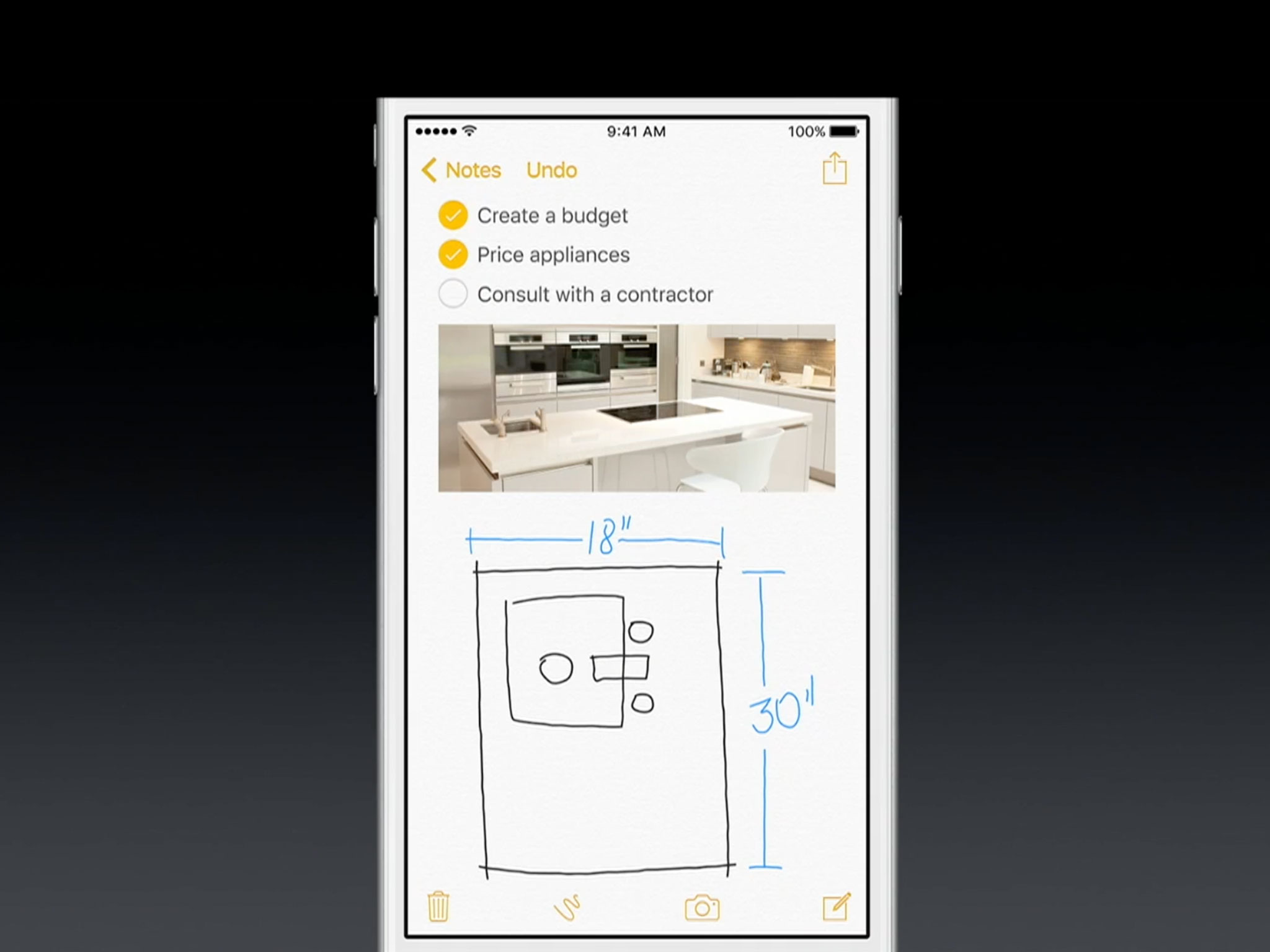
?itok=ALw5E-nc' />[/url]</p> <p>In addition to basic formatting options like bold, italics, and underline, Notes now has simple styling, including title, heading, body, checklists, bulleted lists, and numbered lists.</p> <h3>Checklists vs. Reminders</h3> <p>Checklists in Notes might sound like Reminders, but they work differently and are meant to be used differently. Reminders lets you set time- or location-based alerts for your list items and integrates with Calendar. It's best for tasks like "pick up the dry cleaning when you leave the office" or "order theater tickets at 5pm".</p> <div class="media-gallery-flat"><div data-title="" data-big="/sites/imore.com/files/styles/xlarge/public/field/image/2015/06/wwdc-2015-ios-9-notes-formatting.jpeg?itok=dAH1-79Y" class="flat-img " style="background-image:url(/sites/imore.com/files/styles/w800h450crop/public/field/image/2015/06/wwdc-2015-ios-9-notes-formatting.jpeg?itok=dAH1-79Y);"></div><div data-title="" data-big="/sites/imore.com/files/styles/xlarge/public/field/image/2015/06/wwdc-2015-ios-9-notes-checklist.jpeg?itok=H_vaRwM5" class="flat-img " style="background-image:url(/sites/imore.com/files/styles/w800h450crop/public/field/image/2015/06/wwdc-2015-ios-9-notes-checklist.jpeg?itok=H_vaRwM5);"></div></div> <!--/media-gallery-flat--> <p>Notes lets you make quick checklists within the context of your note but with no functionality beyond the note. It's best for things like a packing lists alongside places you want to go on your trip, or a party list alongside theme ideas.</p> <p>In other words, if you want to be reminded about items, use a Reminders list. If you want to simply jot down items, use a Notes list.</p> <h3>Taking note</h3> <p>The biggest advancement in the new Notes app is all the new content types that can be embedded in a note. Previously, if you could find the option in the popup menu, you could add a picture. Now, you can add sketches, photos, PDF files, videos, audio clips, web links, map locations, Pages documents, Keynote presentations, Numbers spreadsheets, and more.</p> <div class="media-gallery-flat"><div data-title="" data-big="/sites/imore.com/files/styles/xlarge/public/field/image/2015/06/wwdc-2015-ios-9-notes-sketches.jpeg?itok=FKkDFmZB" class="flat-img " style="background-image:url(/sites/imore.com/files/styles/w800h450crop/public/field/image/2015/06/wwdc-2015-ios-9-notes-sketches.jpeg?itok=FKkDFmZB);"></div><div data-title="" data-big="/sites/imore.com/files/styles/xlarge/public/field/image/2015/06/wwdc-2015-ios-9-notes-notes-share-to.jpeg?itok=lgk4rb7z" class="flat-img " style="background-image:url(/sites/imore.com/files/styles/w800h450crop/public/field/image/2015/06/wwdc-2015-ios-9-notes-notes-share-to.jpeg?itok=lgk4rb7z);"></div></div> <!--/media-gallery-flat--> <p>Sketches, not to be confused with the
Apple Watch communications system of the same name, are quick illustrations you can scribble out with your finger right on your iPhone or iPad screen. They, like photos, videos, and the like will simply show in the note. That's in contrast to Map locations, iWork files, and the like that will show up as embeds and, if tapped, open the appropriate app so you can view and interact with them.</p> <p>Since there's no drag-and-drop on iOS like on OS X, Share Sheets is where all the Notes action takes place on iPhone and iPad. From Safari, Maps, Photos, Pages, Numbers, Keynote, etc. choose what you want to clip, go to the Share Sheet, and send it straight to Notes.</p> <p>You can add text to your note right from the Share Sheet, and even choose to create a new note around the clip, or to add it to an existing note.</p> <h3>Sync and search</h3> <p>Because Notes is, as before, tied to your iCloud account, anything you jot down on your iPhone will almost instantly be available on your iPad or Mac as well, and vice versa. It's not EverNote or OneNote, but it's far more than what Notes used to be, and it'll be enough for anyone who doesn't want or need to bother with yet-another app.</p> <div class="media-gallery-flat"><div data-title="" data-big="/sites/imore.com/files/styles/xlarge/public/field/image/2015/07/ios-9-first-look-notes-attachments.jpeg?itok=2RngyCmh" class="flat-img " style="background-image:url(/sites/imore.com/files/styles/w800h450crop/public/field/image/2015/07/ios-9-first-look-notes-attachments.jpeg?itok=2RngyCmh);"></div><div data-title="" data-big="/sites/imore.com/files/styles/xlarge/public/field/image/2015/07/ios-9-first-look-notes-lists.jpg?itok=aewVHtSQ" class="flat-img " style="background-image:url(/sites/imore.com/files/styles/w800h450crop/public/field/image/2015/07/ios-9-first-look-notes-lists.jpg?itok=aewVHtSQ);"></div></div> <!--/media-gallery-flat--> <p>Since there is a level of added complexity, however, Apple has bolstered the built-in search with thumbnails in the list view, and an attachment browser. If you remember adding something to a note, even if you don't remember the exact not, you can still scroll though and pick it out visually.</p> <p>I'll say here what I said in my El Capitan first look—I typically use Notes as a live, iCloud-synced clipboard to move text-based content between my Mac, iPhone, and iPad. I don't see myself switching from BBEdit or Editorial for text, but I do see myself using Notes for even more than I did before: As a way to collect things I want to remember, and have them available everywhere.</p> <h2>Maps</h2> <p>Maps sports several small improvements. For example, Suggested Nearby now sorts points of interest by type, like food, drinks, shopping, etc. Tap into one, and you'll not only get results, but more granular filters.</p> <p><a href='
http://www.imore.com/ios-9-first-look' title="iOS 9 first look: A smarter, smoother experience for iPhone and iPad"><img src='
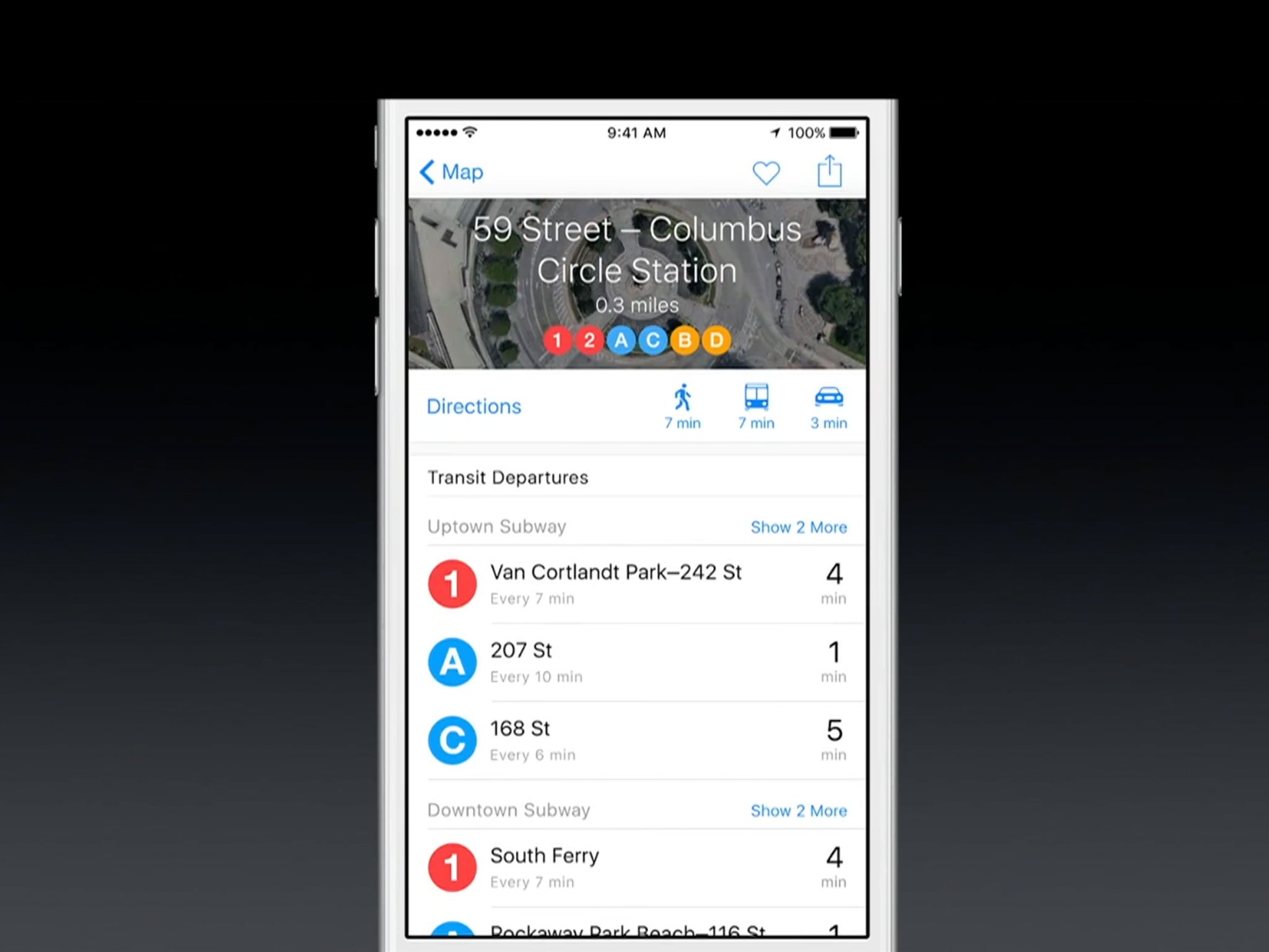
?itok=KPucjbxS' />[/url]</p> <p>On the results cards, there are also directions for walking, transit, and driving, each with easy to see time estimates, and an Apple Pay icon for merchants that accept it.</p> <h3>Transit directions</h3> <p>The bigger news is that iOS 9 restores transit directions to Maps, and that includes bus, train, ferry, and subway. It also includes a new, clean, color-coded set of maps expressly for transit, which makes it easy to find all the stops and stations along your route. Tap on one, and you get all the information you need about that station, including all the other routes it connects with.</p> <div class="media-gallery-flat"><div data-title="" data-big="/sites/imore.com/files/styles/xlarge/public/field/image/2015/06/wwdc-2015-ios-9-maps-transit-directions.jpeg?itok=S3DjThHE" class="flat-img " style="background-image:url(/sites/imore.com/files/styles/w800h450crop/public/field/image/2015/06/wwdc-2015-ios-9-maps-transit-directions.jpeg?itok=S3DjThHE);"></div><div data-title="" data-big="/sites/imore.com/files/styles/xlarge/public/field/image/2015/06/wwdc-2015-ios-9-maps-transit-precision.jpeg?itok=hh2s5eX1" class="flat-img " style="background-image:url(/sites/imore.com/files/styles/w800h450crop/public/field/image/2015/06/wwdc-2015-ios-9-maps-transit-precision.jpeg?itok=hh2s5eX1);"></div></div> <!--/media-gallery-flat--> <p>Since not all stops and stations are connected by transit, Maps will also include walking directions, where needed, to get you where you need to go. Since not all trips are imminent, you'll also be able to see schedules for later in the day.</p> <p>Apple has also carefully surveyed stations so Maps will be able to provide precise directions from where you are to exactly where you need to be, including the exact entrances to stations.</p> <h3>Transit availability</h3> <p>iOS 9 will be launching with support for London, New York, the San Francisco Bay Area, Toronto, Baltimore, Berlin, Chicago, Mexico City, Philadelphia, and Washington, DC, as well as Beijing, Shanghai, Guangzhou, Shenzen, and around 300 cities total in China.</p> <p>That's because transit data is typically controlled by municipal fiefdoms, which means there's no standard format or organization, or incentives for any authority to play nicely with others. China is centralized and unified, so getting that data nation-wide was likely much, much simpler for Apple. Competitors started earlier, so they're further ahead, and Apple will need to catch up.</p> <p>My city, Montreal, didn't make the short list, but I tried out transit in San Francisco while I was there in June. While I don't know the routes like a local, and so can't judge how well Maps navigated them, I could tell that the routes were clearly marked and easy to understand, and worked well enough that I didn't feel stressed just looking at them.</p> <h2>News</h2> <p>Newsstand is no more; it's previously encapsulated apps now set free and strewn across the home screen. In its place is News, which doesn't collect apps—it collects articles. Unlike Apple Music, there's no subscription or cost for News. Instead, it's free for iPhone and iPad customers, and ad supported for publishers.</p> <p><a href='
http://www.imore.com/ios-9-first-look' title="iOS 9 first look: A smarter, smoother experience for iPhone and iPad"><img src='
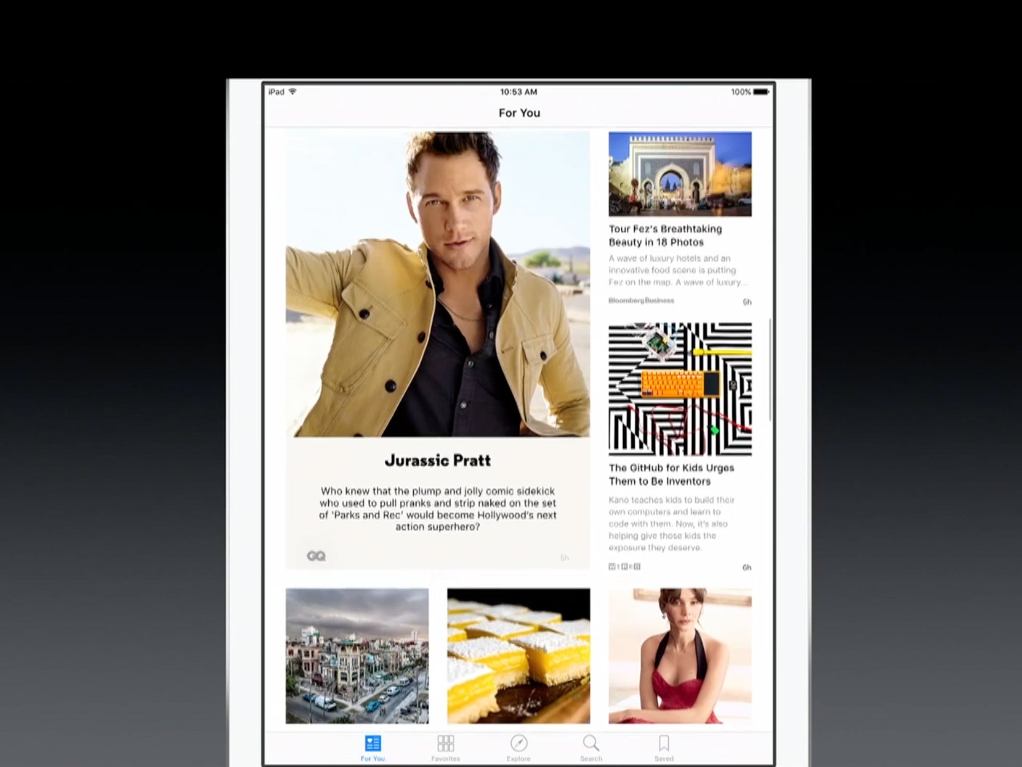
?itok=wna4B1aG' />[/url]</p> <p>Apple announced almost fifty publications that'll be supporting News at launch, and has since registered countless others. News, according to Apple tracks over a million topics, so there should always be something to read.</p> <p>Publications can
sign up for News, but they can also choose to opt-out if they so choose. News is currently only available to people in the U.S., but the U.K. and Australia will also be supported at launch. Other countries should come online over time.</p> <h3>News gathering</h3> <p>To kickstart News, you'll choose some of your favorite sources, like Time, Wired, ESPN, and/or Vanity Fair. As you choose, more options will appear at the bottom. You'll also be able to choose by topic, like science, finance, and/or travel, if you prefer.</p> <div class="media-gallery-flat"><div data-title="" data-big="/sites/imore.com/files/styles/xlarge/public/field/image/2015/07/ios-9-first-look-news-favorites.jpg?itok=VcLxJlIh" class="flat-img " style="background-image:url(/sites/imore.com/files/styles/w800h450crop/public/field/image/2015/07/ios-9-first-look-news-favorites.jpg?itok=VcLxJlIh);"></div><div data-title="" data-big="/sites/imore.com/files/styles/xlarge/public/field/image/2015/06/wwdc-2015-ios-9-news-explore.jpeg?itok=0X5rEMsW" class="flat-img " style="background-image:url(/sites/imore.com/files/styles/w800h450crop/public/field/image/2015/06/wwdc-2015-ios-9-news-explore.jpeg?itok=0X5rEMsW);"></div></div> <!--/media-gallery-flat--> <p>Once you've chosen all the ones that interest you, News will start a personalized feed, called For You, based on those choices. It's a lot like For You in Music, and the consistency is appreciated. Instead of a song list, however, it's more of a front page. A personalized front page, presented much like previous news aggregator apps, with a focus on photos and headlines.</p> <p>If, instead of the aggregated For You front page, you want to read something from a specific news source you've added, you'll be able to find it in the Favorites tab. You'll also be able to browse channels (publications) and topics, like sports, entertainment, business, and more in the Explore tab, and search for them in the Search tab. Any article you bookmark will also show up in the Saved tab so you can read or re-read it later.</p> <h3>In the News</h3> <p>Articles in News can contain text, callouts, photos, mosaics (galleries), videos, and infographics. It's a WebKit-based system, and it'll display articles from almost any standard source. Apple is providing a way to format specifically for News, though. That'll allow for more fluid and dynamic animations and more tailored experience.</p> <div class="media-gallery-flat"><div data-title="" data-big="/sites/imore.com/files/styles/xlarge/public/field/image/2015/06/wwdc-2015-ios-9-news-photo-mosaic.jpg?itok=0UfPyGM2" class="flat-img " style="background-image:url(/sites/imore.com/files/styles/w800h450crop/public/field/image/2015/06/wwdc-2015-ios-9-news-photo-mosaic.jpg?itok=0UfPyGM2);"></div><div data-title="" data-big="/sites/imore.com/files/styles/xlarge/public/field/image/2015/07/ios-9-first-look-news-search.jpg?itok=tpxH9R4s" class="flat-img " style="background-image:url(/sites/imore.com/files/styles/w800h450crop/public/field/image/2015/07/ios-9-first-look-news-search.jpg?itok=tpxH9R4s);"></div></div> <!--/media-gallery-flat--> <p>Ultimately, whether it's a good deal for publishers or a great experience for readers remains to be seen, but at the very least it looks far more consistent and convenient than Newsstand.</p> <h2>Quicktype</h2> <p>Quicktype is the name of the new keyboard introduced last year for iPhone and iPad. The most profound change to it in iOS 9 is the adoption of lowercase key labels on the board itself. It ends, once and for all, any confusion about what the shift-state is the keyboard. It does add a small amount of overhead, however, as your eye has to reacquire a different glyph every time it changes state.</p> <p><a href='
http://www.imore.com/ios-9-first-look' title="iOS 9 first look: A smarter, smoother experience for iPhone and iPad"><img src='
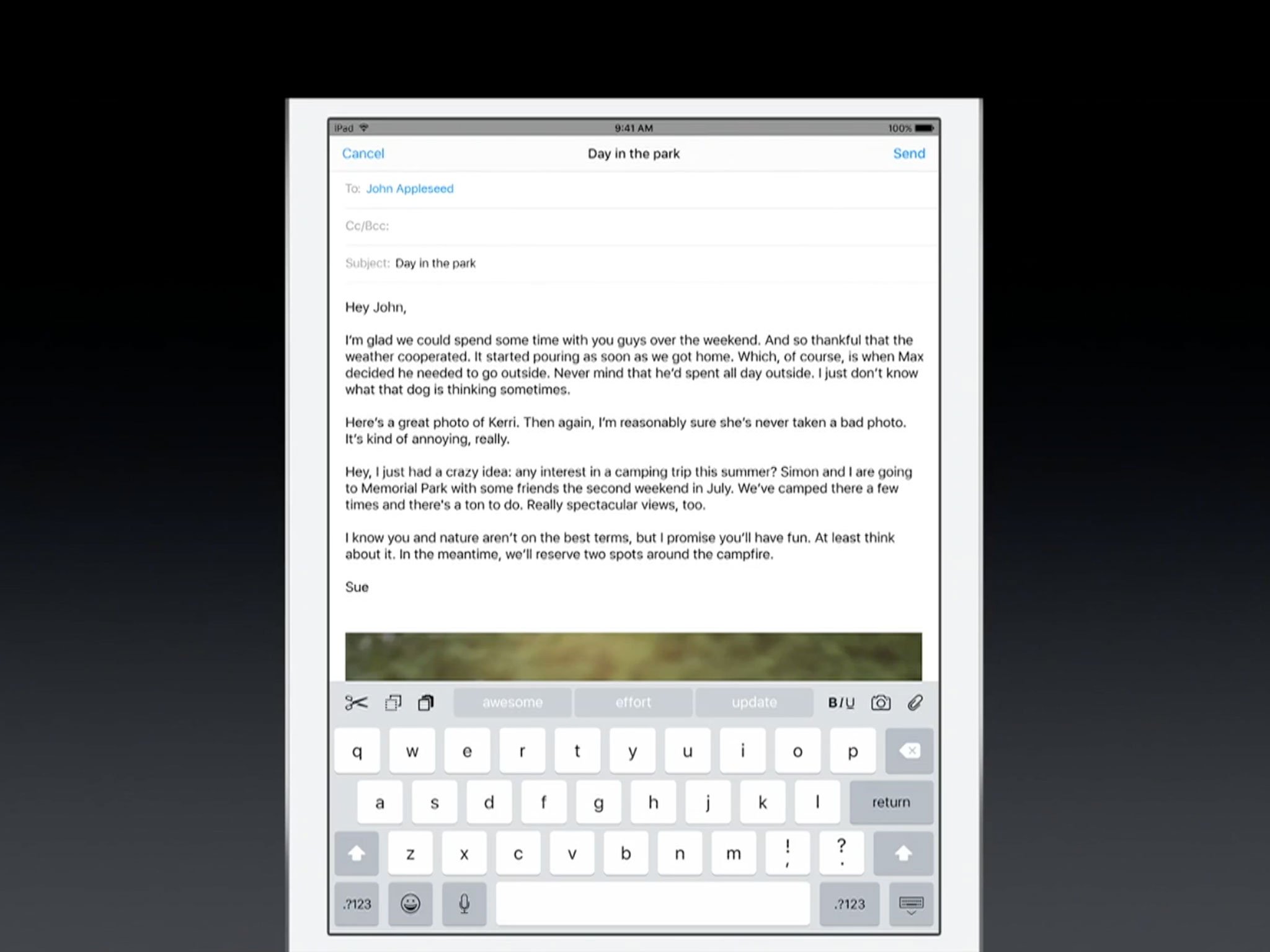
?itok=iB_br15N' />[/url]</p> <p>The keyboard is also no longer popping up the keys as you type, which it used to do to visually reassure you you'd hit the right one. You can still long press to get the alternate character selector, but the basic typing experience is much less old school typewriter and much more digitally native.</p> <p>There are several new features as well, currently all targeted at the iPad.</p> <h3>Shortcuts and trackpads</h3> <p>In addition to the word suggester introduced last year, the row above the iPad keyboard now also contains shortcuts. Because the iPad has a bigger display, and hence more room on that row, Apple has added easy access to cut, copy, and paste to the left side, and bold, italic, underline, and attach to the right.</p> <p>Apps can override and customize the defaults, so no matter what you're doing it should take you fewer taps to do it.</p> <div class="media-gallery-flat"><div data-title="" data-big="/sites/imore.com/files/styles/xlarge/public/field/image/2015/06/wwdc-2015-ios-9-keyboard-toolbar.jpeg?itok=-mJh_4e5" class="flat-img " style="background-image:url(/sites/imore.com/files/styles/w800h450crop/public/field/image/2015/06/wwdc-2015-ios-9-keyboard-toolbar.jpeg?itok=-mJh_4e5);"></div><div data-title="" data-big="/sites/imore.com/files/styles/xlarge/public/field/image/2015/06/wwdc-2015-ios-9-keyboard-trackpad.jpeg?itok=QwAJGrLb" class="flat-img " style="background-image:url(/sites/imore.com/files/styles/w800h450crop/public/field/image/2015/06/wwdc-2015-ios-9-keyboard-trackpad.jpeg?itok=QwAJGrLb);"></div></div> <!--/media-gallery-flat--> <p>It took Apple until iOS 3 to add text selection and editing to iOS and the loupe and handle method remains one of the best implemented in mobile. With iOS 9, however, Apple has also added a "trackpad mode" to the iPad.</p> <p>Place two fingers down on the keyboard and it transforms into a trackpad. Then you can simply move your fingers to move the cursor point anywhere you like. The result is text selection that's even better than best.</p> <p>While currently iPad-only, it's so useful I hope it comes to the iPhone as well.</p> <h3>Bluetooth bonus</h3> <p><a href='
http://www.imore.com/ios-9-first-look' title="iOS 9 first look: A smarter, smoother experience for iPhone and iPad"><img src='
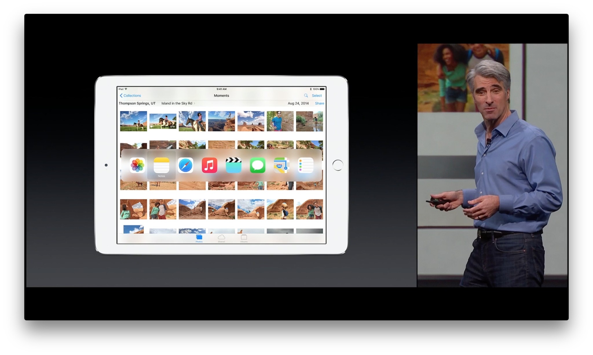
?itok=FJZTCc5G' />[/url]</p> <p>If a hardware keyboard is your thing, iOS 9 is making those easier to use as well. Hold down a modifier key to see a list of available shortcuts for any app. And press Command + Tap to switch tasks as quickly as you do on the Mac.</p> <p>It's yet another step forward for those who use the iPad in lieu of an ultralight laptop.</p> <h2>Mutil-app multitasking</h2> <p>The iPad, like the iPhone, has always had phenomenal multitasking. iOS is built on the same foundation as OS X, after all. For reasons of security and power efficiency, however, Apple has tightly constrained the amount of multitasking surfaced to App Store apps and to customers.</p> <p><a href='
http://www.imore.com/ios-9-first-look' title="iOS 9 first look: A smarter, smoother experience for iPhone and iPad"><img src='
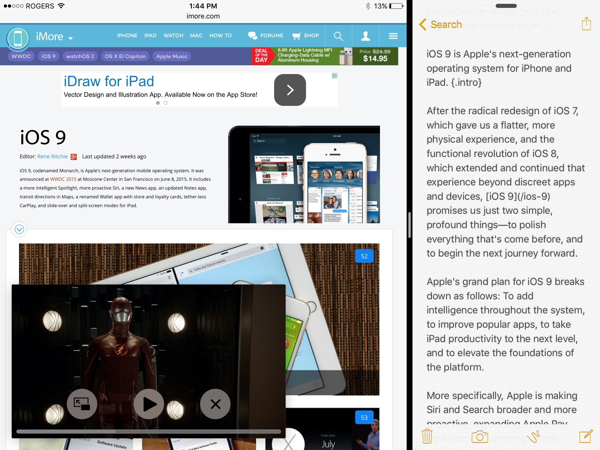
?itok=TO7aNz2P' />[/url]</p> <p>Over the years we've gone from nothing to a few specific background task threads to just-in-time background refresh, extensibility, and more. Together, it provides much of the benefits of full on multitasking. Except for multiple apps or windows running at the same time.</p> <p>That's where iOS 9 for the iPad comes in.</p> <h3>Slide Over</h3> <p>Slide Over works on the iPad Air, iPad Air 2, iPad mini 2, and iPad mini 3. With it, you can briefly access a second app without having to leave the app you're currently using. For example, if you're reading this first look in iMore and want to chat with a friend about it, you don't have to switch back and forth between Safari and Messages and feel massive displacement each time. All you have to do is swipe in from the right bezel and the Slide Over sidebar will appear. To get rid of it, swipe it away or tap anywhere on the primary app. (If that sounds as easy as Notification Center or Control Center, that's because it is.)</p> <div class="media-gallery-flat"><div data-title="" data-big="/sites/imore.com/files/styles/xlarge/public/field/image/2015/07/wwdc-2015-ios-9-multitasking-slide-over.jpeg?itok=u8WHnPpJ" class="flat-img " style="background-image:url(/sites/imore.com/files/styles/w800h450crop/public/field/image/2015/07/wwdc-2015-ios-9-multitasking-slide-over.jpeg?itok=u8WHnPpJ);"></div><div data-title="" data-big="/sites/imore.com/files/styles/xlarge/public/field/image/2015/06/wwdc-2015-ios-9-multitasking-slide-over-switcher.jpeg?itok=oOTSRzcN" class="flat-img " style="background-image:url(/sites/imore.com/files/styles/w800h450crop/public/field/image/2015/06/wwdc-2015-ios-9-multitasking-slide-over-switcher.jpeg?itok=oOTSRzcN);"></div></div> <!--/media-gallery-flat--> <p>To change the app contained in the Slide Over, you swipe down from the top of the sidebar, scroll through the options, and tap the icon for the app you want to switch to.</p> <p>When Slide Over is active, the original (primary) app you were using becomes inactive, so you can't use both apps at once. That's what Split View is for. Slide Over isn't mean for sustained use. It's meant for quick interactions. The exception is media: audio and video will keep playing even while you're using Slide Over. Video will still dim slightly, and the right side will be covered over with the side bar, but that's why there's Picture-in-Picture as well.</p> <p>Apple already has Slide Over working with Mail, Messages, Photos, iBooks, Videos, Game Center, Contacts, Calendar, Clock, QuickTime, Maps, Notes, Podcasts, and pretty much all the company's apps. They've also demonstrated Twitter working in Slide Over and said that any app that supports the Adaptive UI (Auto Layout and Size Classes) introduced over the last few years should be able to support Slide Over without too much trouble. (Think of it like presenting a compact, iPhone-width version of the app inside the Slide Over sidebar on the iPad.)</p> <p>The result is something that makes good use of the iPad display without compromising it—it never gets in your way, it's just conveniently there whenever you need it.</p> <h3>Split View</h3> <p>Split View is currently only available on the iPad Air 2. Unlike Slide Over, Split View doesn't freeze the primary app and confine the secondary app to a sidebar. Split View is full-on dual-app multitasking.</p> <p><a href='
http://www.imore.com/ios-9-first-look' title="iOS 9 first look: A smarter, smoother experience for iPhone and iPad"><img src='
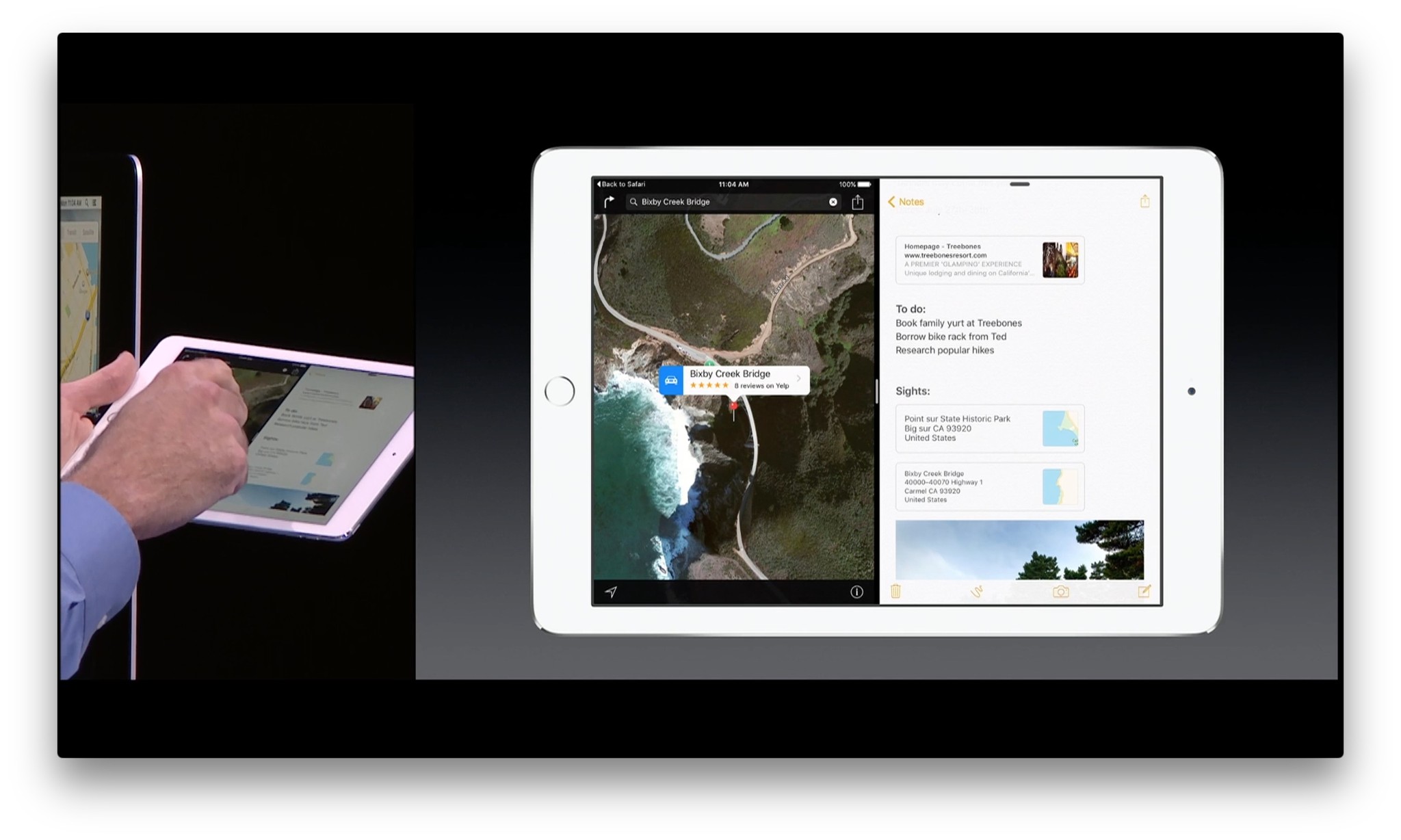
?itok=olw8B3tu' />[/url]</p> <p>To get into Split View, you start with Slide Over and then tap the divider. That transforms it into Split View. From there, you can drag to adjust the width of each side. (Though you can't make any app too narrow to fit its own content and iOS will nudge things towards standard ratios, like 50/50).</p> <p>To get out of Split View, you drag the divider all the way across: right to keep only the primary app, left to keep only the secondary app.</p> <p>To change the secondary app (the one on the right), you can use the same downward swipe as Slide Over to access the same app switcher.</p> <p>To change the primary app (the one on the left), you can use the typical iPad app-switching methods: Click the Home button to return to the Home screen and select another app, double-click the Home button to bring up the fast app switcher and select another app, use the four-finger gesture navigation to swipe back or forth between apps, or tap on a link that opens another app.</p> <p>It's not multi-window, multi-app like the Mac where you can have interfaces stacked and strewn all over the place, and drag and drop between them. It also requires an iPad Air 2 because that's currently the only device with the 2GB of RAM and monstrous Apple A8X processor capable of handling two apps at full speed at the same time. It's also not the first system to do app-pinning or split-view multi-windowing.</p> <p>But iOS 9 is implementing the ideas smoothly and fluidly, and with what appears to be a lot of care and consideration. And so far,
so functional.</p> <h3>Picture-in-picture (PiP)</h3> <p>Picture-in-Picture works on iPad Air, iPad Air 2, iPad mini 2, and iPad mini 3. It recognizes that, for video, sometimes neither slid over nor view split are ideal. So, it lets the video float on top of whatever other app or apps you're using and keep on playing regardless of what else you're doing. (Except for watching another video: tap to play one and it'll pause the other.)</p> <div class="media-gallery-flat"><div data-title="" data-big="/sites/imore.com/files/styles/xlarge/public/field/image/2015/06/wwdc-2015-ios-9-multitasking-pip.jpeg?itok=d76_4FqA" class="flat-img " style="background-image:url(/sites/imore.com/files/styles/w800h450crop/public/field/image/2015/06/wwdc-2015-ios-9-multitasking-pip.jpeg?itok=d76_4FqA);"></div><div data-title="" data-big="/sites/imore.com/files/styles/xlarge/public/field/image/2015/06/wwdc-2015-ios-9-multitasking-pip-tuck-png.jpeg?itok=Otp1oSuw" class="flat-img " style="background-image:url(/sites/imore.com/files/styles/w800h450crop/public/field/image/2015/06/wwdc-2015-ios-9-multitasking-pip-tuck-png.jpeg?itok=Otp1oSuw);"></div></div> <!--/media-gallery-flat--> <p>To enter Picture-in-Picture mode, you tap the new PiP button. It sits just to the left of the full-screen button on the standard video controller. Once it's floating, you can drag it to any corner of the screen, and resize it with a pinch. It's not a complete free-for-all, however. iOS will bounce the PiP to an exact position where it doesn't cover up important controls, and an exact size where it's not too small to see or so big it defeats the purpose of PiP.</p> <p>You can also tuck the PiP away on the side of the screen. That way only a small part of the edge remains visible—so you'll be able to find it again later when you need to—but the audio keeps playing, so you can keep listing. It's useful for when you need the whole screen but don't want to pause the video.</p> <p>Like AirPlay, some apps may build their own video players and not include PiP functionality for licensing or ad-splicing related reasons. I hope that doesn't happen, though. The functionality is so great it would be a huge loss to usability if it gets disabled.</p> <p>On the iPad Air 2, you can have Picture-in-Picture running on top of Slit View, for a total of three apps all live, all at the same time.</p> <p>For it to work, each app has to play nicely and share resources that used to be theirs and theirs alone. So, there'll likely be some growing pains at first, and some times when an especially resource intensive App Store app—we all know the usual social suspects—gets us jettisoned back to the Home screen.</p> <p>Like any transition, it'll take time for everyone to update. But sitting here, Safari on one side, Notes on the other, The Flash season finale playing on top, and already I can't imagine going back, or iPad functionality being any other way.</p> <h2>Performance + Battery life</h2> <p>Apple took a lot of hits when it came to software stability last year. That happens every year, of course, but iOS 7 and iOS 8 brought fundamental changes to the way the iPhone and iPad looked and worked, and more than a little pain along with them. iOS 9 addresses a lot of that.</p> <p>For performance, Apple is greatly increasing the scope of Metal, the graphics framework the company introduced last year as a thinner, faster alternative to OpenGL. This year Apple is folding in OpenCL, the general computing framework, as well, and moving the CoreGraphics and CoreAnimation frameworks to sit on top of it all.</p> <p>That means any app already using any of those frameworks should see an instant boost to performance; Apple claims 1.6x in animation and scrolling and 50% reduction in CPU usage for drawing.</p> <p>For battery life, Apple is making iOS 9 smarter. For example, if iOS detects that your device is face down, it'll suppress lock screen notifications, which prevents the display from lighting up, which saves power. All told, Apple claims that'll add up to one hour of extra battery life thanks to optimizations alone.</p> <p>For more, there's Low Power mode.</p> <h3>Low Power mode</h3> <p>You can enter Low Power mode at any time through Settings, and iOS will prompt you when you get the standard 20% and 10% battery life warnings. If and when you enabled it, mail fetch will be turned off, as will background refresh, motion effects, and more. All told, Low Power mode will give you up to an additional three hours of battery life when you need it most.</p> <p>You don't have to worry about missing things like mail—it'll all still download and become available when you open the Mail app, for example. It just won't waste power on it until you're in it. I tried it extensively while roaming in the U.S.—always a tremendous battery drain due to cellular network performance—and it worked fantastically well.</p> <h2>Security + Privacy</h2> <p>We'll likely have to wait until Apple updates the company's always outstanding iOS Security White Paper to find out all the details about iOS 9 improvements, but a few things have already been announced.</p> <h3>6-digit passcodes</h3> <p>With iOS 9, the old 4-digit passcode is becoming the new 6-digit passcode. That's still nowhere nearly as strong as the alphanumeric password option, but it's an improvement and, thanks to TouchID, one that won't significantly impact convenience for people who prefer the pin.</p> <h3>2-factor authentication</h3> <p>Apple is building full 2-factor authentication for iCloud accounts into both iOS 9 and OS X El Capitan. It's separate from, and will eventually replace, the old 2-step authentication system Apple previously used for some iCloud services. Notably, it doesn't include a recovery key but a recovery process. That's rattled some information security people but will probably prove more practical for the mainstream customer base Apple is targeting. (Where data loss, not data compromise, is the more frequent and damaging concern.)</p> <h3>App transport security</h3> <p>App transport security will hopefully force everyone towards TLS 1.2, and eventually better connections. That will help keep our data safe as it gets transferred between apps and the cloud.</p> <h3>Device-centric, discreet data operations</h3> <p>As mentioned previously, Apple is taking a fundamentally different approach to data operations than many of its web-centric competitors. So, instead of taking your data up to the cloud and operating on it there, the way an Internet company like Google or Facebook might, Apple operates on Internet data in the cloud, then brings it down to your device, and operates on your data there.</p> <p>That way, you don't have to worry about your personal data persisting on Apple's servers or anywhere else.</p> <p>What's more, Apple has said they won't share data from one service to another, so Proactive doesn't touch News doesn't touch Music, and so on. That way, if you only use a few Apple services, you don't have to worry about your data being available to other services.</p> <p>Whether or not that matters to you will depend on how you feel about online privacy to begin with. No matter what, though, it's good for everyone to have options and alternatives.</p> <h2>Updating</h2> <p>Last year a lot of people ran into problems updating to iOS 8. More specifically they ran out of storage space and couldn't download the update. Apple's been working hard ever since to reduce the amount of space necessary to update.</p> <p>While iOS 8 was over 4.5 GB in size, iOS 9 will just 1.3 GB. That means you'll need less space to update. Apple has also introduced new services like iCloud Photo Library and iCloud Music Library, which should better optimize local storage and ensure more space for updates as well.</p> <p>Apple will also offer to let you temporarily remove apps, and immediately restore them, if it makes the difference between having enough space to update or not. What's more, Apple has implemented "app thinning" so that apps take up less space on your device going forward. With app thinning, the App Store to only deliver the parts of an app that are needed to run on your specific device. So, if it's not an iPhone 6 Plus, app slicing means you won't get the @3x graphic resources, for example. If it's a new game, on-demand resources means you'll only get the early levels at first, not all of them. Apple will also be delivering bitcode, which means it will be able to make minor optimizations to best suit the chipsets you're running, now and into the future.</p> <p>There will also be new options to update when you're asleep, or when you're not using your device. It's all designed to make the whole updating process as stress-free as possible.</p> <h2>Miscellany</h2> <p>There's a lot more to iOS 9 than just the tentpoles. Apple has made a lot of small but welcome changes throughout the system, and a few major changes to the system itself. Beyond the developer-specific features, many of them will make the iPhone and iPad more enjoyable and more accessible.</p> <h3>Fast app switcher</h3> <p><a href='
http://www.imore.com/ios-9-first-look' title="iOS 9 first look: A smarter, smoother experience for iPhone and iPad"><img src='
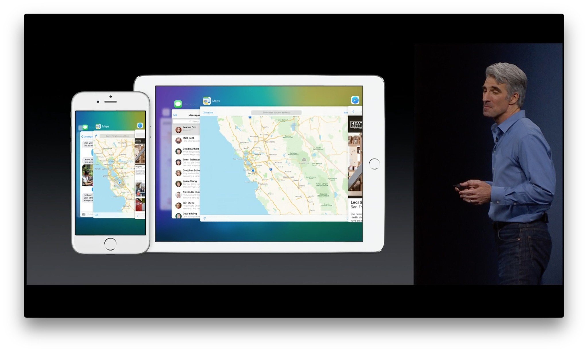
?itok=i8vBWnWm' />[/url]</p> <p>There's a new fast app switcher interface for iPhone and iPad that replaces the flat card view with a new stacked and staggered card view. You can still clearly see three sets of apps and icons—previous, current, and next—but now you also get the blurry hint of a fourth in the background.</p> <p>The new layout may need some sort of reduced motion mode for those with vertigo and similar conditions, but it does provide for much bigger app thumbnails so you can more clearly see what's on a screen before tapping on it.</p> <p>Continuity apps still appear here as well.</p> <h3>Photos</h3> <p><a href='
http://www.imore.com/ios-9-first-look' title="iOS 9 first look: A smarter, smoother experience for iPhone and iPad"><img src='
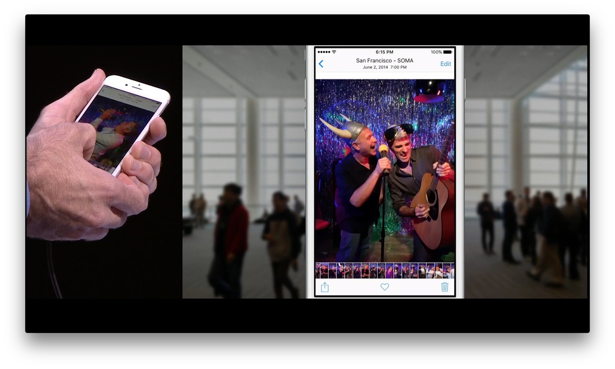
?itok=khmiX45S' />[/url]</p> <p>In addition to Siri access, Photos in iOS 9 is getting an everything-old-is-reinvented-again scrubber. It not only lets you swipe through photos faster, when you're in single photo view, it lets you see the photos before and after it in the sequence. That provides more context, but it also makes finding the right photo much more efficient—no swiping blindly or jumping back to moments or albums just to see what else is around.</p> <p>It's also highly likely that anyone who ever wanted an automated screenshot folder will be happy, and that an automagic selfie photo might have just come along for the ride.</p> <h3>Safari</h3> <p>Apple's web browser gets a couple small yet significant new features for iOS 9. First, Safari can now be embedded in other apps. That means, if developers implement the Safari View Controller, when you tap on a link inside an app, all your logins, bookmarks, form data, and everything else is available to you, just as if you were in Safari proper. It's a huge improvement and leverages extensibility to make sure it's still private and secure.</p> <p>Speaking of extensibility, there's also new content blocker extensions. Developers can use them to make apps that'll let you suppress bits of websites, most obviously ads, but also social plugins, heavy interactive elements, or pretty much anything at all.</p> <p>It might simply mean more ads go native and social sites figure stick to tracking pixels, but it will hopefully move the web towards better, lighter performance.</p> <h3>Typography</h3> <p><a href='
http://www.imore.com/ios-9-first-look' title="iOS 9 first look: A smarter, smoother experience for iPhone and iPad"><img src='
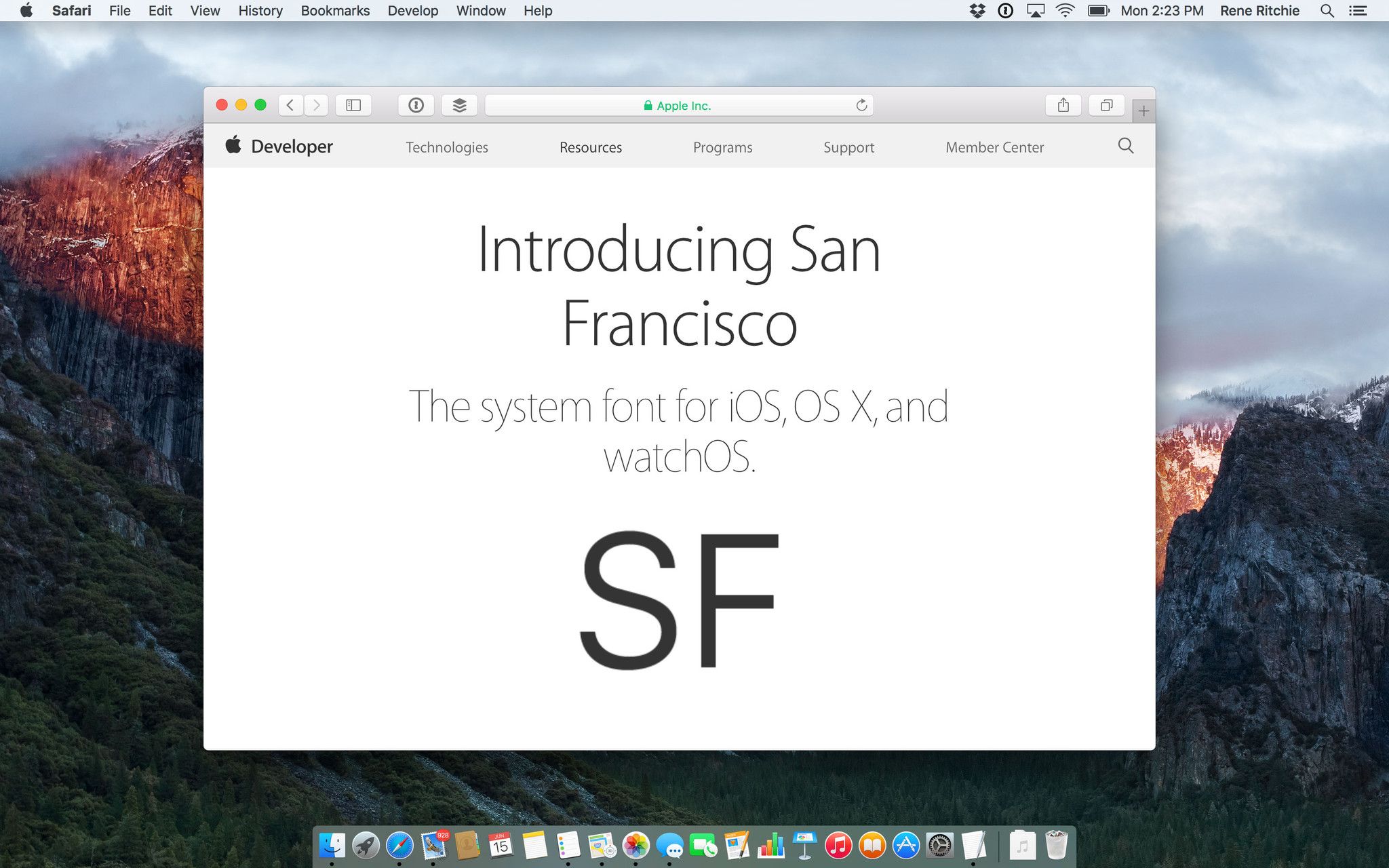
?itok=SvViWH1K' />[/url]</p> <p>After years of Helvetic and a brief flirtation with Helvetica Neue, Apple has released its own system font: San Francisco. Specifically for iOS 9 and OS X El Capitan: SF. (Though there's at least one case of iOS 9 using the Apple Watch version, SF Compact, and to great effect.)</p> <p>There are two optical sizes for SF: Text and Display. Text is for anything under 20 pt, Display for anything over 20 pt. Most time you won't have to worry about the difference—the system handles it automatically. If you're doing work in an image editor, however, and want to match the way SF looks on the screen, you'll need to manually change from Text to Display when you go above 20 pt.</p> <p>There are six weights for Text, both regular and italic: Light, Regular, Medium, Semibold, Bold, and Heavy. Display has nine weights total, adding: Ultralight, Thin, and Black.</p> <p>It's
gorgeous.</p> <h3>Right-to-left languages</h3> <p>Impressively, Apple has also added full, system-wide support for right-to-left languages like Arabic and Hebrew. That includes every bit of every interface, from button placement to gesture direction, all working flawlessly for any app that's already using UIKit and Auto Layout.</p> <p>It's a different kind of accessibility, but it's every bit as important. Kudos, once again.</p> <h3>Health + Home</h3> <p>In iOS 9 the Health app, and HeathKit service, adds reproductive health tracking—yes, finally!—along with UV exposure, water intake, and sedentary state.</p> <div class="media-gallery-flat"><div data-title="" data-big="/sites/imore.com/files/styles/xlarge/public/field/image/2015/06/wwdc-2015-ios-9-health.jpeg?itok=lrkzm81c" class="flat-img " style="background-image:url(/sites/imore.com/files/styles/w800h450crop/public/field/image/2015/06/wwdc-2015-ios-9-health.jpeg?itok=lrkzm81c);"></div><div data-title="" data-big="/sites/imore.com/files/styles/xlarge/public/field/image/2015/06/wwdc-2015-ios-9-homekit-accessories.jpeg?itok=ujjDcbYT" class="flat-img " style="background-image:url(/sites/imore.com/files/styles/w800h450crop/public/field/image/2015/06/wwdc-2015-ios-9-homekit-accessories.jpeg?itok=ujjDcbYT);"></div></div> <!--/media-gallery-flat--> <p>HomeKit, Apple's standard for home automation, will now support window coverings, doors, alarm systems, sensors, and switches. There are also new, standard scenes that any device can access, including getting up and going to bed, and leaving and returning home.</p> <p>Custom triggers will let you set up sequences of events, for example, if the door is unlocked and the motion sensor detects you moving towards the kitchen, it can turn on the lights and fire up the coffee maker.</p> <p>Better still, HomeKit can now tie directly into iCloud, so you can control everything remotely even if you don't have an Apple TV to serve as the hub.</p> <p>There's no Home.app, but there is a HomeKit section in Settings now, making basic management much more consistent and convenient.</p> <h3>Print to PDF</h3> <p>Sure, it's called Save PDF to iBooks, but by Gelphman it's there. From any screen with a Share button, just tap to open the sheet, and tap again to generate the PDF.</p> <h3>CarPlay</h3> <p><a href='
http://www.imore.com/ios-9-first-look' title="iOS 9 first look: A smarter, smoother experience for iPhone and iPad"><img src='
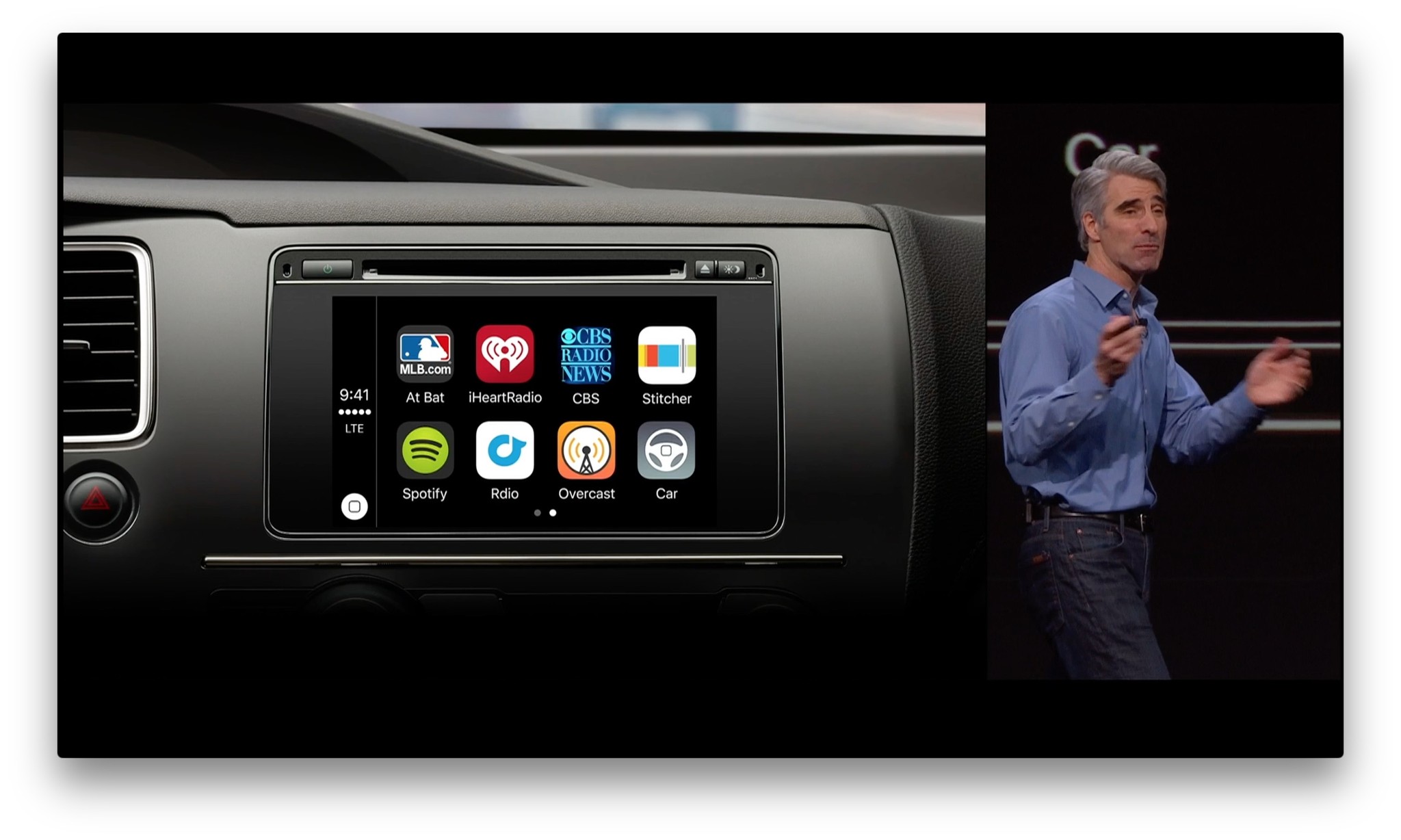
?itok=v5JIDDIY' />[/url]</p> <p>With iOS 9, CarPlay gets better support for knob control, so you can tilt, spin, and scroll through apps. There's also support for manufacturer apps so that you can control the features specific to your vehicle, as well as support for audio messages and different aspect and HiDPI displays.</p> <p>A CarPlay connection will also allow your iPhone to use your car as a geofence for Siri and Reminders. So, you can say, "Remind me to call the dealer and give them my mileage when I get in the car".</p> <p>Also, CarPlay is going wireless. It'll only be available for new cars, and only when manufacturers start rolling out support, but if and when you get such a miracle vehicle, your days of needing a Lightning cable in the glove box will be behind you.</p> <h2>Coming this fall</h2> <p>iOS 9 is currently in both developer and public beta and is scheduled for general availability this fall. It's a free update, and it'll support all devices currently running iOS 8. That goes all the way back to the iPhone 4s, iPod touch 5, original iPad mini, and iPad 2. In other words, everything from 2011 on forward.</p> <p><a href='
http://www.imore.com/ios-9-first-look' title="iOS 9 first look: A smarter, smoother experience for iPhone and iPad"><img src='

?itok=9yOUbFnh' />[/url]</p> <p>It's not the radical redesign of iOS 7 or the functional revolution of iOS 8, but iOS 9 has the performance and polish that makes everything that came before better, and sets the iPhone and iPad up for everything that comes next.</p> <p>I've thoroughly enjoyed testing it in beta—especially on the iPad Air 2—and look forward to using it in its final, finished form this fall.</p> <div class="devicebox"> <h3>
iOS 9</h3> <p>
<img src="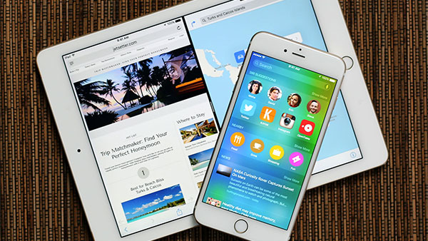 " />
" /></p> <ul><li>
iOS 9 FAQ</li> <li>
iOS 9 Help</li> <li>
iOS 9 News</li> <li>
iOS 9 discussion</li> </ul></div> <div> <style> <!--/*--><![CDATA[/* ><!--*/ <!--/*--><![CDATA[/* ><!--*/ <!--/*--><![CDATA[/* ><!--*/ .devicebox { background-color: #5CB8DB; border: 1px solid #E2E9EB; float: right; display: block; margin: 0 0px 10px 10px; max-width: 350px; overflow: hidden; width: 50%; } .devicebox h3 { background: #8D98BD; font-family: "camptonmedium",sans-serif; font-size: 20px; margin-bottom: 0; margin-top: 0; padding: 0; text-align: center; } .devicebox h3 a { display: block; line-height: 30px; padding: 0 10px; } .devicebox h3 a:hover { background: #7e88aa; text-decoration: none; } .devicebox .video { margin: auto; } .devicebox p, .entry-content .devicebox p > img, .devicebox img { margin: 0px; max-width: 100%; padding: 0px; } div .devicebox *, div .devicebox li, div .devicebox a:active, div .devicebox a:hover, div .devicebox a:link, div .devicebox a:visited { color: #fff; } .devicebox a:hover { text-decoration: underline; } .devicebox p, .devicebox ul li, .devicebox ol li { font-size: 16px; padding: initial; } .devicebox ul { margin: 0; padding: 0.5em 1em 1em 30px; } .devicebox ul li { display: list-item; line-height: 24px; list-style: disc outside none; } .devicebox ul li:before { display: none; } .devicebox p ~ p { padding: 0px 15px 15px; line-height: 1.25; } .devicebox p:first-of-type + p { padding: 15px; } div *:last-of-type + .devicebox, div *:last-of-type + div ~ .devicebox { float: none; margin: 0 auto 30px; max-width: 700px; min-height: 225px; position: relative; width: 100%; } div *:last-of-type + .devicebox .video, div *:last-of-type + div ~ .devicebox .video { bottom: 0px; left: 50%; position: absolute; ri