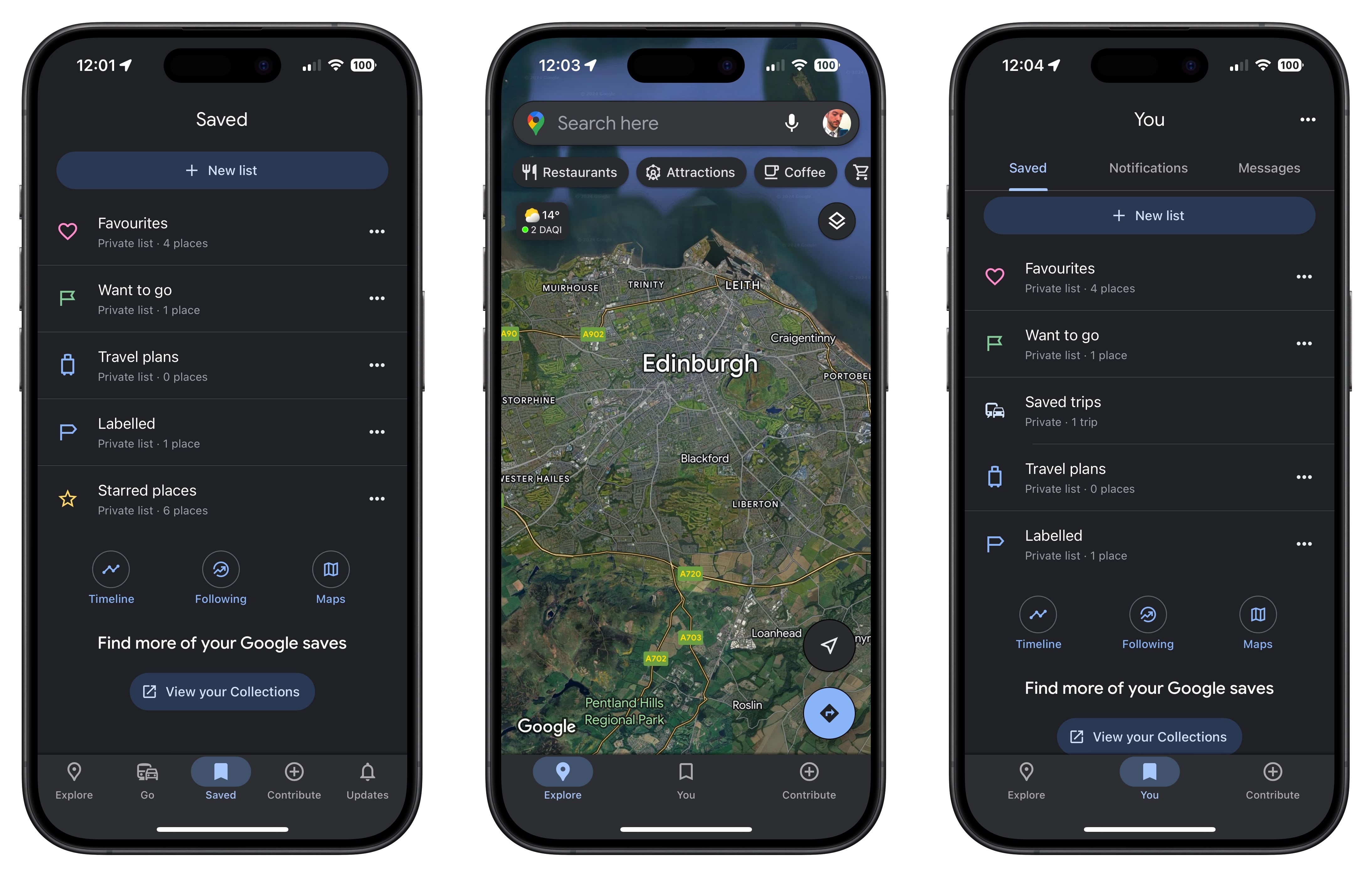
Google Maps Loses Two Tabs Out of Five in Bottom Bar RedesignGoogle Maps is rolling out a redesigned bottom bar to iPhones that aims to give the app a less cluttered look by reducing the number of tabs on the screen.

<div class="center-wrap">
Old Google Maps bottom bar (left) vs. new one</div>
Previously only on Android, the new bottom bar reduces the number of tabs from five to three. As spotted by
9to5Google, "Go" has been removed, but users can still access it using a new "You" middle tab, via a new "Saved trips" section therein.
"You" was previously called "Saved," and retains the same bookmark icon. But tapping it takes you to an updated page with new top tabs for "Notifications" and "Messages," both of which serve content that was previously found in the "Updates" tab, now removed. That leaves "Contribute" as the last tab of the three on the main maps screen.
<ul><li>
Apple Maps vs. Google Maps: Which Is Better?</li></ul>
The rollout is occurring in version 6.129.1 of Google Maps. If you've updated and don't see the new bottom bar, try force-quitting the app via the app switcher screen and then re-open it, which worked for us.<div class="linkback">Tag:
Google Maps</div>
This article, "
Google Maps Loses Two Tabs Out of Five in Bottom Bar Redesign" first appeared on
MacRumors.comDiscuss this article in our forums
Source:
Google Maps Loses Two Tabs Out of Five in Bottom Bar Redesign