Apple Music ‘Browse’ tab reorganized to help users find music and playlists with fewer taps<div class="feat-image">

</div>
<p>Overnight,
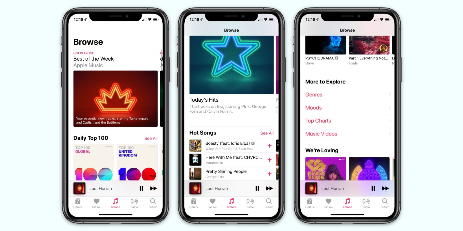
the Apple Music service has received a server-side upgrade which results in a redesigned ‘Browse’ tab in the Music app for iPhone and iPad. The new look seems to be rolling out slowly, as some readers are reporting they are still seeing the previous design.</p>
<p>Previously, the Browse tab was laid out with a single horizontally-scrolling carousel of featured content and then a list of navigation options, which would start deep navigation hierarchies before users of the app would actually see any real content. The new design surfaces much more music upfront, accessible with one tap.</p>
<p> <a href="
https://9to5mac.com/2019/03/22/apple-music-browse-tab-redesigned/#more-584950" class="more-link">more…[/url]</p>
<p>The post <a rel="nofollow" href="
https://9to5mac.com/2019/03/22/apple-music-browse-tab-redesigned/">Apple Music ‘Browse’ tab reorganized to help users find music and playlists with fewer taps[/url] appeared first on <a rel="nofollow" href="
https://9to5mac.com">9to5Mac[/url].</p><div class="feedflare">
<img src="[url]http://feeds.feedburner.com/~ff/9To5Mac-MacAllDay?i=5mXuldmFdaE:BwSfNdwhTnE:D7DqB2pKExk" border="0"></img>[/url]
</div><img src="
http://feeds.feedburner.com/~r/9To5Mac-MacAllDay/~4/5mXuldmFdaE" height="1" width="1" alt=""/>
Source:
Apple Music ‘Browse’ tab reorganized to help users find music and playlists with fewer taps