Apple Community Envisions Better Ways to Activate Control Center on iPhone XOne of the biggest software changes on Apple's new iPhone X is the location of Control Center, the useful user interface that provides you with quick access to music playback controls, Bluetooth and Wi-Fi toggles, the flashlight, calculator, and much more thanks to
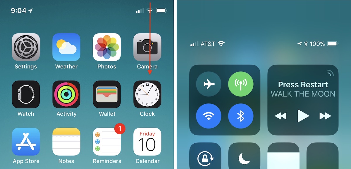
iOS 11's customizable layout. On pre-iPhone X devices, the Control Center is awoken by swiping up from the bottom edge of the device. Because that action is now the default "go home" gesture on iPhone X, Apple has moved Control Center to the top right edge of the smartphone.
This location change has removed the simplicity and ease-of-access to Control Center for many iPhone X users -- particularly those who are left handed -- who have been posting about the iPhone X-specific issue in the
MacRumors forums, Twitter, and on Reddit. Some of these users have also provided interesting alternative locations and invoking gestures that Apple could potentially implement in future iOS updates, but it should be reiterated that these are simply community ideas and not in any way an indication that we'll see them added to the iPhone X.
<img src="

" alt="" width="1200" height="580" class="aligncenter size-full wp-image-603220" /><center>
How to activate Control Center on iPhone X</center>Reddit has been the source of multiple ideas for new Control Center gestures on the iPhone X, with a few that replace existing gestures (so you'd have to choose between two options in Settings) and some that are new.
One user theorized that the iPhone X's new Reachability gesture (swiping down on the Home indicator,
which must be activated in Settings) could have an alternate option for invoking Control Center.
Further threads provided variations on this idea: 3D Touch on the Home indicator for Reachability and pulling down on the indicator for Control Center, or keeping Reachability as it is and
using 3D Touch on the
Home indicator for Control Center. The 3D Touch solution has been put forward by multiple people over the last few days and appears to be a favorite, particularly because Reachability's new swipe-down gesture on the Home indicator can be difficult to execute and could potentially be an even more frustrating location for Control Center.
Other ideas have been shared on the
MacRumors forums, including one that could be an
additional option for the swipe-down gesture that enacts Search anywhere on the Home Screen, but that would make Control Center impossible to call up within apps. iOS developer Guilherme Rambo
posted his own idea on Twitter this week, suggesting that a 3D Touch edge swipe could house Control Center. Currently, this is used as an app switching gesture, which Apple
at first removed from iOS 11 and then
brought back in a later update, so it's another idea where you'd have to pick one setting over another.
<center><blockquote class="twitter-tweet" data-lang="en"><p lang="en" dir="ltr">This feels really natural, 3D Touch swipe from the edge to bring up Control Center would be an awesome option to have on iPhone X
pic.twitter.com/SIYNWlh1LW</p>— Guilherme Rambo (@_inside)
November 8, 2017<script async src="
https://platform.twitter.com/widgets.js" charset="utf-8"></script></center> While Rambo's idea appears to be focused on Control Center replacing an app switcher gesture, a few users have also had ideas where Control Center is added into the app switcher. In these, you'd swipe up and hold to access other apps as normal, and Control Center would potentially be the first app you see instead of the last-used app. Or, Apple could place it on the right side of the app switcher, as
one Redditor posited. Another mockup by Twitter user
@jwangARK placed buttons under the app switcher for easy access to both Notifications and Control Center.
Another iOS developer, Riley Testut, theorized a
simple solution that would place Control Center at the bottom right edge of the iPhone X display instead of the top right edge, while swiping up from the center would still go Home. A few iPhone X users have also
pointed towards
Assistive Touch in Accessibility as a workaround for easier Control Center activation, but that comes with a permanent, virtual Home Button on your iPhone screen, which will be a hard trade-off for some iPhone X owners.
With the iPhone X out in the wild for one full week as of today, November 10, the location of Control Center is one of a few gripes that early adopters have had with Apple's newest smartphone. Another notable point of contention focused on the
iPhone X keyboard's "wasted space", with users presenting a few potential solutions to that as well, including placing recently used emoji or punctuation in the empty field below the space bar.
Make sure to check out our
iPhone X Roundup for more details on the smartphone's new features.
<div class="linkback">Related Roundups:
iOS 11,
iPhone X</div><div class="linkback">Tag:
Control Center</div><div class="linkback">Buyer's Guide:
iPhone X (Buy Now)</div>
Discuss this article in our forums
<div class="feedflare">
<img src="[url]http://feeds.feedburner.com/~ff/MacRumors-Front?d=yIl2AUoC8zA" border="0"></img>[/url]
<img src="[url]http://feeds.feedburner.com/~ff/MacRumors-Front?d=6W8y8wAjSf4" border="0"></img>[/url]
<img src="[url]http://feeds.feedburner.com/~ff/MacRumors-Front?d=qj6IDK7rITs" border="0"></img>[/url]
</div><img src="
http://feeds.feedburner.com/~r/MacRumors-Front/~4/DLzhWNYQCt0" height="1" width="1" alt=""/>
Source:
Apple Community Envisions Better Ways to Activate Control Center on iPhone X