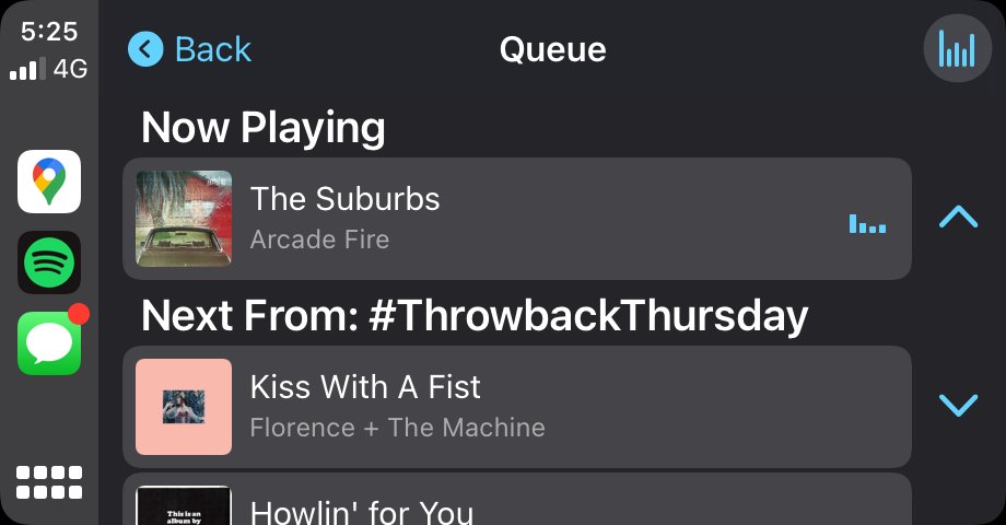
Spotify Starts Testing New CarPlay Interface With Queue SystemSpotify has introduced a new
CarPlay interface in the latest beta version of the app that is now available via TestFlight.

<div class="center-wrap">
Image credit: Shaun Ruigrok</div>
Notably, the redesigned UI adds a new queue system that brings the Spotify ‌CarPlay‌ experience a lot closer to the way
Apple Music works.
Users can now see which tracks are queued up without having to look at their
iPhone, thanks to a "Go to queue" button on the Now Playing screen. Users can now also navigate to an artist's Spotify page by tapping the artist's name.
Elsewhere, the ‌CarPlay‌ app includes four tabs at the top of the screen for quick access to Home, Recently Played, Browse, and Library, while more album artwork and new accents add a lick of color to the interface.
It's not known when the updated version will arrive in the
App Store, but its presence in TestFlight is a good indicator that it should be on the way soon.
In November, Spotify rolled out support for
standalone streaming through the Spotify app for Apple Watch, allowing users to listen to music or podcasts from Spotify over WiFi or cellular without having to have an ‌iPhone‌ nearby.<div class="linkback">Tags:
CarPlay,
Spotify</div>
This article, "
Spotify Starts Testing New CarPlay Interface With Queue System" first appeared on
MacRumors.comDiscuss this article in our forums
<div class="feedflare">
<img src="[url]http://feeds.feedburner.com/~ff/MacRumors-Front?d=yIl2AUoC8zA" border="0"></img>[/url]
<img src="[url]http://feeds.feedburner.com/~ff/MacRumors-Front?d=6W8y8wAjSf4" border="0"></img>[/url]
<img src="[url]http://feeds.feedburner.com/~ff/MacRumors-Front?d=qj6IDK7rITs" border="0"></img>[/url]
</div><img src="
http://feeds.feedburner.com/~r/MacRumors-Front/~4/q6FQLBGAGIA" height="1" width="1" alt=""/>
Source:
Spotify Starts Testing New CarPlay Interface With Queue System