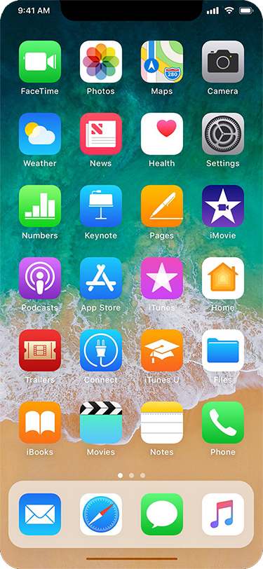
Here's What the Status Bar and iPad-Style Dock Could Look Like on 'iPhone 8'Earlier today, well-connected Apple reporter Mark Gurman said the so-called "iPhone 8" will have a
thin software-based bar along the bottom of the home screen, controlled by gestures, in lieu of a physical home button.
Gurman also said the Dock, which houses up to four commonly used apps, will be redesigned with a new interface similar to the one on the iPad version of iOS 11. Above it, there will still be six rows of apps, with up to 24 apps per page.
The status bar is said to be split into left and right sides, which some Apple employees supposedly call "ears" internally. By default, the left side shows the time, while the right side displays Wi-Fi, signal bars, and battery life.
With those details in mind, graphic designer Olivier Charavel
created a mockup of what the Home screen could look like on the iPhone 8.
<img src="

" alt="" width="375" height="812" class="aligncenter size-full wp-image-585127" />
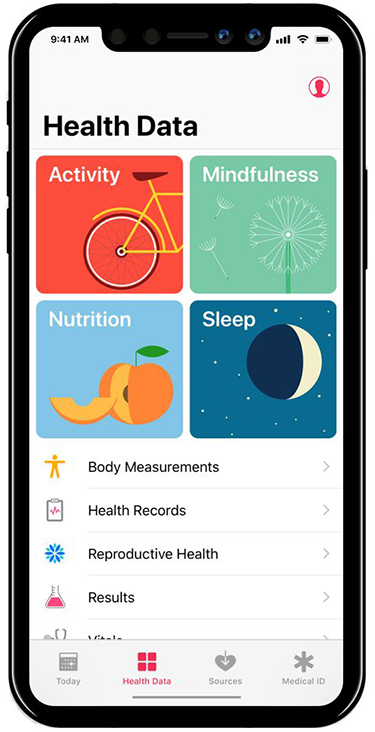
Charavel also shared a mockup of Apple's Health app as an example of what apps could look like on the iPhone 8 accordingly.
<img src="

" alt="" width="375" height="732" class="aligncenter size-full wp-image-585154" />
Gurman said users can drag the gesture bar up to the middle of the screen to unlock the device. When inside an app, a similar gesture starts multitasking, and users can continue to flick upwards to close the app and go back to the home screen.
Guilherme Rambo
shared a video that demonstrates how it could look once the Dock has been summoned, based on Apple's iOS simulator for developers.<center><blockquote class="twitter-tweet" data-lang="en"><p lang="en" dir="ltr">This is what the floating dock looks like on an iPhone
pic.twitter.com/BbKVIL7yO8</p>— Guilherme Rambo (@_inside)
August 30, 2017<script async src="//platform.twitter.com/widgets.js" charset="utf-8"></script></center><strong>More Coverage</strong>:
iOS 11 Dock and Gesture Controls to Replace "iPhone 8" Home Button Entirely by Tim Hardwick
<div class="linkback">Related Roundup:
iPhone 8 </div>
Discuss this article in our forums
<div class="feedflare">
<img src="[url]http://feeds.feedburner.com/~ff/MacRumors-Front?d=yIl2AUoC8zA" border="0"></img>[/url]
<img src="[url]http://feeds.feedburner.com/~ff/MacRumors-Front?d=6W8y8wAjSf4" border="0"></img>[/url]
<img src="[url]http://feeds.feedburner.com/~ff/MacRumors-Front?d=qj6IDK7rITs" border="0"></img>[/url]
</div><img src="
http://feeds.feedburner.com/~r/MacRumors-Front/~4/v5-HO5uv4ss" height="1" width="1" alt=""/>
Source:
Here's What the Status Bar and iPad-Style Dock Could Look Like on 'iPhone 8'