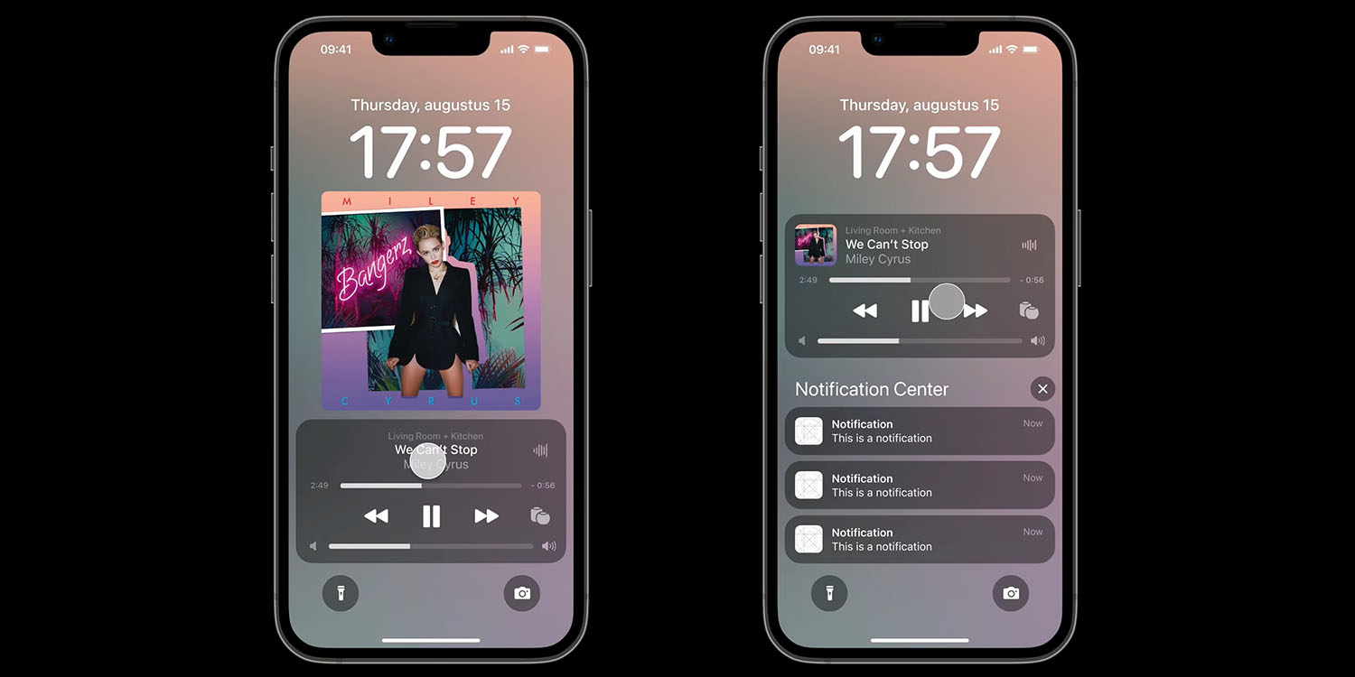
iOS 16 Lock Screen concept shows how music player could work well with notifications<div class="feat-image">

</div>
<p>The <a href="
https://9to5mac.com/guides/ios-16/" target="_blank" rel="noreferrer noopener">iOS 16[/url] Lock Screen sees a new user-interface for the <a href="
https://9to5mac.com/guides/apple-music/" target="_blank" rel="noreferrer noopener">music[/url] player, most notably <a href="
https://9to5mac.com/2022/07/11/ios-16-beta-adds-music-podcast-preview-on-lock-screen/" target="_blank" rel="noreferrer noopener">letting you see full width album art[/url], like the gods intended.</p>
<p>But things get messy when notifications are shown, something a design student set out to correct … </p>
<p> <a href="
https://9to5mac.com/2022/08/16/ios-16-lock-screen-2/#more-827740" class="more-link">more�
https://9to5mac.com/2022/08/16/ios-16-lock-screen-2/">iOS 16 Lock Screen concept shows how music player could work well with notifications[/url] appeared first on <a rel="nofollow" href="
https://9to5mac.com">9to5Mac[/url].</p>
Source:
iOS 16 Lock Screen concept shows how music player could work well with notifications