What the iPhone 15 Pro's Volume Buttons Could Look Like [Updated]Update: Newly obtained information
confirms that Apple plans to revert to a two-button design for the
iPhone 15 Pro models, rather than using the single unified volume button. The unified volume button was a design planned for the solid-state technology, and Apple is opting to use the older design now that solid-state buttons have been delayed.
Though Apple is using the prior two-button design for volume, the company still plans to replace the mute switch with a new mute button. The mute button could potentially be customizable, working similarly to the Action button on the
Apple Watch Ultra.
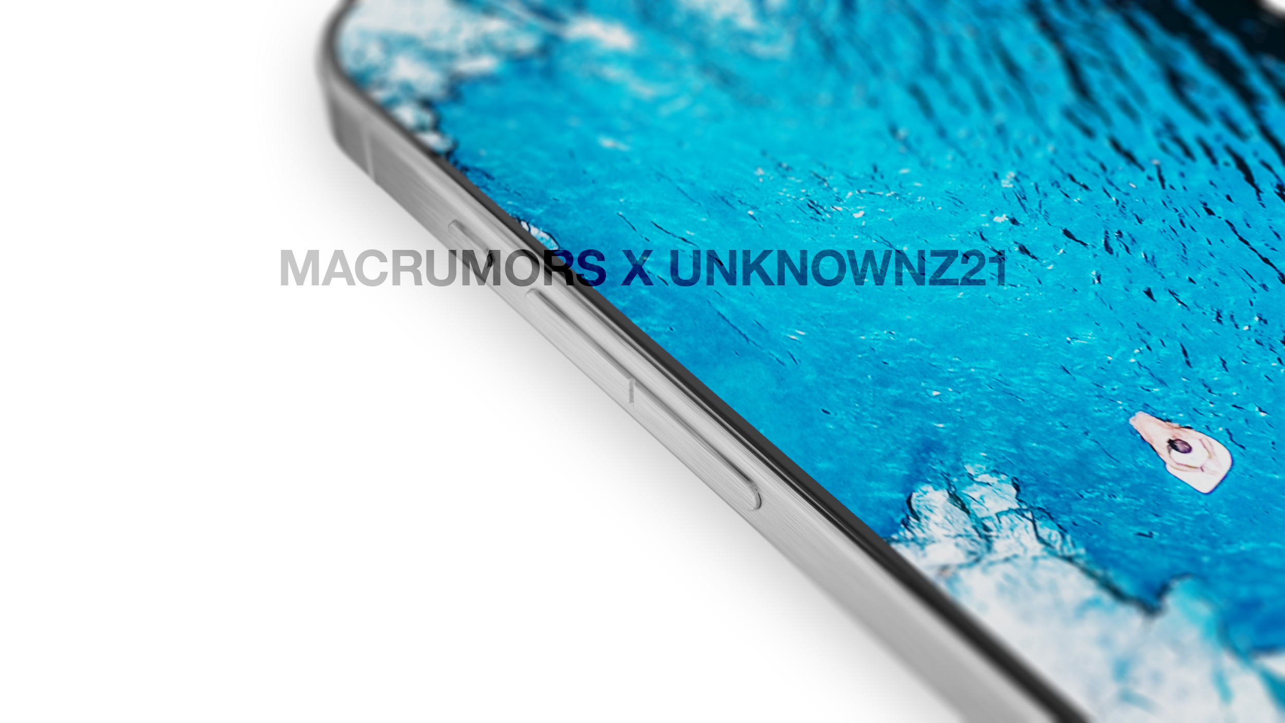
The renders in this article represent the design that Apple planned to use prior to opting to eliminate solid-state buttons, featuring the design that Apple planned for during much of the ‌iPhone 15 Pro‌ development process. This is likely the design that Apple will use for the
iPhone 16 Pro models, which are now expected to include the solid-state button technology instead of the ‌iPhone 15 Pro‌ models.
The original article is below.
With recent rumors indicating a last-minute change to the ‌iPhone 15 Pro‌'s feature set, what's in store for the device's volume buttons remains to be seen. We've heard multiple rumors that the ‌iPhone 15 Pro‌ models are set to adopt a new volume button and mute switch design, but emerging rumors about Apple's
abandonment of solid-state button technology throw the design rumors into chaos.

As of right now, there is no indication that Apple will change its plans for a single, elongated volume button and a mute button instead of a mute switch, and we have an accurate look at what the buttons will look like provided there are no radical design shifts in store.
Leaker Unknownz21 worked with
MacRumors to share the actual design of the ‌iPhone 15 Pro‌'s volume and mute buttons, which haven't been seen before now.

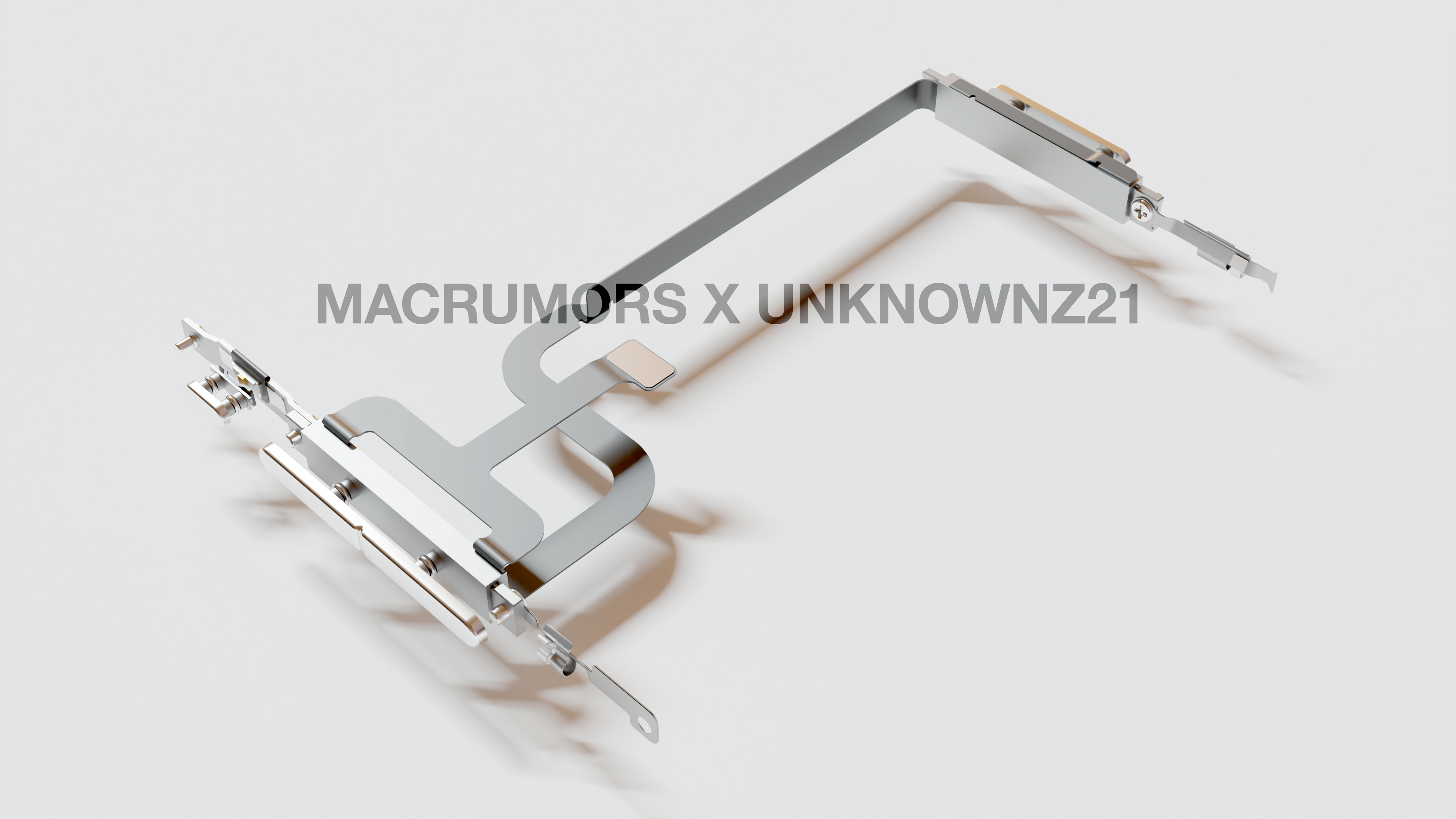
We used ‌iPhone 15 Pro‌ information sourced from Unknownz21 to create images that depict the design of the volume, mute, and power buttons, including a view of the internal components. Note that these renders were created before the most recent solid-state rumors, there could be changes to the internal layout, but there is a good chance the external design will remain the same. In fact, Unknown21 has confirmed that the solid-state button design was still in development until very, very recently, and there is a chance that it hasn't been canceled at all.

Leaks to date have gotten the single volume rocker rumor right, but the design that Apple developed includes a split in the middle to designate the volume up and volume down sections of the button. With the middle split, the design looks similar to two separate buttons, but it is a notable departure from the current button design in which the volume up and volume down buttons are distinct.
<div class="center-wrap"><iframe width="560" height="315" src="
https://www.youtube.com/embed/cIU6r1o3z48" title="iPhone 15 Pro's Volume Button Design" frameborder="0" allow="accelerometer; autoplay; clipboard-write; encrypted-media; gyroscope; picture-in-picture; web-share" allowfullscreen></iframe></div>
Apple has not used this kind of unified button design since the
iPhone 3GS in 2009, as the company swapped to two separate round volume up and down buttons with the ‌iPhone‌ 4, and ultimately transitioned to dual elongated buttons with the 2014 launch of the ‌iPhone‌ 6. It is worth highlighting that the single button design the middle separation has been in place since the early ‌iPhone 15 Pro‌ development period.
Apple initially planned to introduce the single volume button design alongside solid-state technology, but reliable Apple analyst
Ming-Chi Kuo believes solid-state buttons
have been abandoned. There were "unresolved technical issues" that Apple was unable to address before mass production, so solid-state buttons will be delayed and ultimately introduced with a
later version of the iPhone.
Solid-state technology is what Apple uses for the Mac's trackpad and the Home button on
Touch ID iPhones. With this feature, the volume button on the ‌iPhone 15 Pro‌ and Pro Max would not have physically depressed, instead using haptic feedback to mimic the feel of a press. With haptic buttons delayed, Apple could instead use the single button design with standard physical buttons.
<div class="center-wrap"><blockquote class="twitter-tweet"><p lang="en" dir="ltr">So far I haven’t seen anything to suggest a different exterior design for the buttons - if this is true then I think it’ll likely be more of an internal change, rather than something visible.
Currently, EVT units use the existing design - although changes are always possible 🤔
https://t.co/eK71637HRJ</p>— Unknownz21 🌈 (@URedditor)
April 12, 2023 <script async src="
https://platform.twitter.com/widgets.js" charset="utf-8"></script></div>
In his Medium post, Kuo said the buttons will have a "traditional physical button design," but he did not provide context on whether Apple would stick with the single volume button design change or revert to the same two button design that was used for the
iPhone 14 models. There is now some added mystery surrounding what kind of volume button design we'll get for the ‌iPhone 15 Pro‌ and 15 Pro Max, and there are arguments both for keeping the single button design and for reverting to the prior design. Unknownz21 believes that Apple will make minimal changes to the buttons at this point, and that while there could be added separation between the buttons, the design will not be the same as the ‌iPhone 14‌ button design.

Given that there are other internal changes planned for the ‌iPhone 15 Pro‌ and Pro Max to accommodate new camera technology (specifically in the case of the periscope lens for the Pro Max), it may not be easy for Apple to go back to the original volume button design. Additionally, there were rumors that Apple planned to replace the mute switch with a mute button, and that the button could serve as a
multi-use Action button similar to the Action button on the ‌Apple Watch Ultra‌.

The ‌Apple Watch Ultra‌ Action button and the Side button on all Apple Watch models use physical button technology. They are not haptic or solid-state, so a case can be made that what works for the watch will work for the ‌iPhone‌. Apple can retain the single volume button and the "Action" button even without a shift to haptic technology. Apple has been referring to the button as the "ringer button" or "action button" internally, which does indeed seem to suggest there could be a multi-function customizable button.
<div class="center-wrap"><iframe width="560" height="315" src="
https://www.youtube.com/embed/aoGQTPEnNbQ" title="The iPhone 15 Pro's Volume Module" frameborder="0" allow="accelerometer; autoplay; clipboard-write; encrypted-media; gyroscope; picture-in-picture; web-share" allowfullscreen></iframe></div>
We have a detailed look at the module (codenamed "Bongo") that Apple designed for the volume button, mute button, and power button, created with information about the internal layout. While the renders still give a look at the potential external design that Apple will go with, it is likely that there are going to be internal changes to this design. Apple initially intended to add two additional Taptic Engines to the ‌iPhone 15 Pro‌ models to power the haptic buttons, but those will no longer be needed.

Unless Apple has last minute plans to abandon the mute switch to button transition and the elongated volume button in favor of the prior design, what we are sharing here today is a true-to-life depiction of what the ‌iPhone 15 Pro‌ and Pro Max will look like. It is the most complete picture of the ‌iPhone 15 Pro‌ to date, and it is the design that Apple has conceptualized since the ‌iPhone 15 Pro‌ was in early design stages.
While the loss of solid-state button technology is a major disappointment for those who were looking forward to it, Apple has other notable design changes that are coming to the ‌iPhone 15 Pro‌ models. The device chassis will be made from titanium, which is the same material that Apple uses for the ‌Apple Watch Ultra‌. Like the frame, the buttons will be made from titanium as well.
Titanium is stronger than aluminum and lighter weight than stainless steel, the material that Apple used for the
iPhone 14 Pro. We are expecting a weight reduction for the ‌iPhone 15 Pro‌ compared to the ‌iPhone 14 Pro‌ just based on material update, but final weight will be dependent on the alloy that Apple uses and the internal layout changes.
Titanium has more of a brushed, matte finish than stainless steel, and the more subdued texture will be more resistant to fingerprints. Apple has also tested
a shiny mirror finish for the ‌iPhone 15 Pro‌ frame, so there is a small chance that both shiny and matte options could be offered for some of the models. As titanium is stronger than stainless steel, the ‌iPhone 15 Pro‌'s frame could be more resistant to dents, dings, and bending, but it may be easier to scratch because the oxide layer is easily damaged.
In addition to a titanium frame, the ‌iPhone 15 Pro‌ and Pro Max will also have a design that slims down the bezels and deepens the curve at the corners of the device, so while it will look similar to the ‌iPhone 14 Pro‌, it will be distinct. The bezels are notably smaller and will increase the available display area somewhat, but no changes are expected for the
Dynamic Island.
Other ‌iPhone 15 Pro‌ features include TSMC's 3-nanometer A17 chip, a USB-C port instead of a Lightning port, a periscope camera lens for the ‌iPhone 15 Pro‌ Max with expanded optical zoom, faster 5G, and Wi-Fi 6E.
Note that many new additions, including the planned unified volume button, the mute button, and the titanium frame, will be limited to the higher-end ‌iPhone 15 Pro‌ and ‌iPhone 15 Pro‌ Max and will not be available with the standard
iPhone 15 models.
For more on the ‌iPhone 15 Pro‌ and Pro Max, we have a dedicated <strong>
iPhone 15 Pro roundup</strong> that aggregates everything we've heard so far, and we also have a <strong>
separate iPhone 15 roundup</strong> that gives a better idea of the differences between the Pro and non-Pro models.<div class="linkback">Related Roundup:
iPhone 15 Pro</div><div class="linkback">Tag:
Unknownz21</div>
This article, "
What the iPhone 15 Pro's Volume Buttons Could Look Like [Updated]" first appeared on
MacRumors.comDiscuss this article in our forums
Source:
What the iPhone 15 Pro's Volume Buttons Could Look Like [Updated]