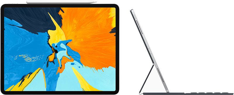
First Impressions From New 2018 iPad Pro OwnersWe've already seen
iPad Pro reviews from media sites that Apple invited to test the tablet ahead of its release, but now that the
iPad Pro has officially launched, first impressions from regular Apple customers are now available.
New <!---->iPad Pro<!----> owners on Reddit, Twitter, and the
MacRumors forums have been sharing their opinions on the device, and for those considering a purchase, opinions from average consumers provide useful insight.
<img src="
" alt="" width="800" height="325" class="aligncenter size-full wp-image-663999" />
MacRumors reader
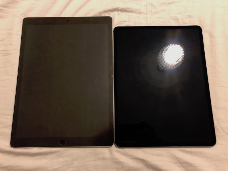
TrueBlou shared some images of the old 12.9-inch <!---->iPad Pro<!----> next to the sleeker, slimmer 2018 12.9-inch version, providing a look at just how much smaller the new model is. He says the difference is an "incredible improvement."
<img src="
" alt="" width="800" height="600" class="aligncenter size-full wp-image-665113" />
It's an incredible improvement, I really cannot overstate just how much of a difference it is. It's one of my favourite things about the new iPad.
It's not just that it's smaller, lighter and thinner - which of course it is. But the combination of all of those things also changes its centre of gravity a little and it's really noticeable.
Reddit user
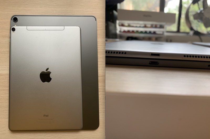
SlightCriticism offered up a look at the 10.5-inch <!---->iPad Pro<!----> on top of the new 12.9-inch model, which gives a good idea of how much bigger the 12.9-inch model is.
<img src="
" alt="" width="800" height="531" class="aligncenter size-full wp-image-665115" />
He says he's ultimately going to swap the 12.9-inch model for the 11-inch because the 12.9-inch model is still too heavy for one-handed use.
I had a first gen 12.9 which was too big and sprung for the 10.5 when it came out last year. I found the original 12.9 to be too difficult to hold on the train etc but the 10.5 has been the perfect companion. I did miss the extra screen space, but its size was harming my productivity and I decided I valued that more. I really thought the size decrease of this gen was going to be the perfect solution for me, and my first impressions were positive, but after using it for a while I've found it still a bit too heavy for prolonged one-handed use. Of course this isn't the case for everyone and I'm sure a lot of people will find it a terrific size.
MacRumors reader
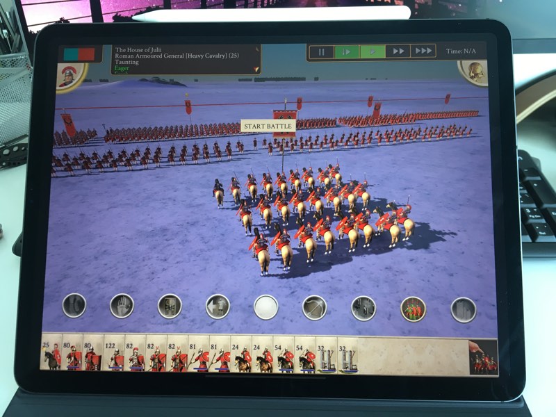
ryuok pointed out that because the new 11-inch <!---->iPad<!----> is using a different aspect ratio, apps that are not updated have black bars on both sides. Apps will get updates eventually, but it's something to be aware of.
<img src="
" alt="" width="800" height="600" class="aligncenter size-full wp-image-665116" /><center>
A 12.9-inch <!---->iPad Pro<!----> with black bars via MacRumors reader jun180</center>There are two kinds of black bars:
1) Rounded corner black bars: This is similar to the iPhone X situation, before apps are updated to accommodate the extra spaces extended by the rounded corners. This affects both the 11" model and 12.9" model.
2) Aspect ratio black bars: This only happens on 11", and it is far worse and far more notifiable than the "Rounded corner black bars". If an app is not coded to dynamically adapt to aspect ratio, you'll see horrifyingly large black bars especially in landscape mode. It's almost like seeing an iPad mini sized app, inside an 11" screen. Populars apps such as Facebook and Netflix are affected by this.
Reddit user
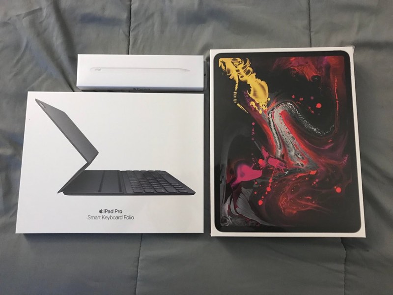
atru22 said the new
Smart Keyboard Folio takes some getting used to, but he likes it a lot more than the previous-generation keyboard. He also says the 12.9-inch model feels surprisingly small.
<img src="
" alt="" width="800" height="600" class="aligncenter size-full wp-image-665120" /><center>
Image via Reddit user atru22</center>
On the topic of the
Apple Pencil, Reddit user
essjay2009 said that the Pencil feels quite different in the hand and that there's more friction when using it. Charging and pairing is much improved, of course, since it just needs a magnetic attachment to the <!---->iPad Pro<!---->.
I will say that the pencil feels very different in the hand. It's a little shorter but that makes a huge difference. I always thought the gen 1 felt a little ridiculously large (length wise). This feels more like a normal pencil. The double tap feature is really nice and far more forgiving than I was expecting. I thought you'd have to tap specifically on a certain spot, but it seems to just pick up double taps pretty much anywhere reasonable.
Pairing and charging is soo much better. And that's coming from someone who didn't have any particular issue with the way the old one charged.
Reddit user
dvegi also thought there's much better drag with the <!---->Apple Pencil<!----> 2 and the <!---->iPad Pro<!---->'s new display.
So, just wanted to let you guys know that there is a much better drag with the <!---->Apple Pencil<!----> 2 and the <!---->iPad Pro<!---->, than before (a lot of people didn’t like how the pencil felt on glass so resorted to getting a matte screen protector— but no need with the new <!---->iPad Pro<!---->!)
Reddit user
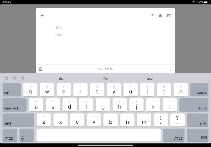
GottaDeal confirms that the new 11-inch <!---->iPad Pro<!----> on-screen keyboard has a 12.9-inch keyboard layout thanks to the extra room from the removal of the bezels. It offers up tab, caps lock, and left side shift keys, unlike the 10.5-inch <!---->iPad Pro<!---->.
<img src="
" alt="" width="800" height="559" class="aligncenter size-full wp-image-665129" />
MacRumors reader
ninethirty wasn't a fan of the <!---->Smart Keyboard<!----> Folio, calling it a "design nightmare."
Got my 12.9 today. The <!---->iPad<!----> itself is absolutely beautiful, but the design of the smart folio keyboard is awful. It doesn't fold around as easily as the previous keyboard, it makes everything a lot thicker, and quite frankly, the materials of the folio itself feel cheap, which is a shame. But worst of all, when you fold the folio to the back of the ipad, to hold and watch a video or something, the keys are exposed on the back.
MacRumors reader
largefarrva disagreed, though, saying that he likes it a lot and is impressed with the key feel.
I actually like it quite a bit. I was a bit worried that the keyboard would feel like the butterfly keyboards of the MacBooks nowadays but it doesn't at all. Hell, if the MacBooks had keys that felt like this they wouldn't be nearly as bad. Granted it is very little travel in a keystroke, but the feedback is a ton times better than the MacBook keyboards.
Have a new 2018 <!---->iPad Pro<!---->? Share your first impressions and photos in the comments below. We'll have an unboxing video and our own hands-on later today, so make sure to stay tuned to
MacRumors for more <!---->iPad Pro<!----> coverage.
<div class="linkback">Related Roundup:
iPad Pro</div><div class="linkback">Buyer's Guide:
11" iPad Pro (Buy Now),
12.9" iPad Pro (Buy Now)</div>
Discuss this article in our forums
<div class="feedflare">
<img src="[url]http://feeds.feedburner.com/~ff/MacRumors-Front?d=yIl2AUoC8zA" border="0"></img>[/url]
<img src="[url]http://feeds.feedburner.com/~ff/MacRumors-Front?d=6W8y8wAjSf4" border="0"></img>[/url]
<img src="[url]http://feeds.feedburner.com/~ff/MacRumors-Front?d=qj6IDK7rITs" border="0"></img>[/url]
</div><img src="
http://feeds.feedburner.com/~r/MacRumors-Front/~4/iD-DxjAwtzI" height="1" width="1" alt=""/>
Source:
First Impressions From New 2018 iPad Pro Owners