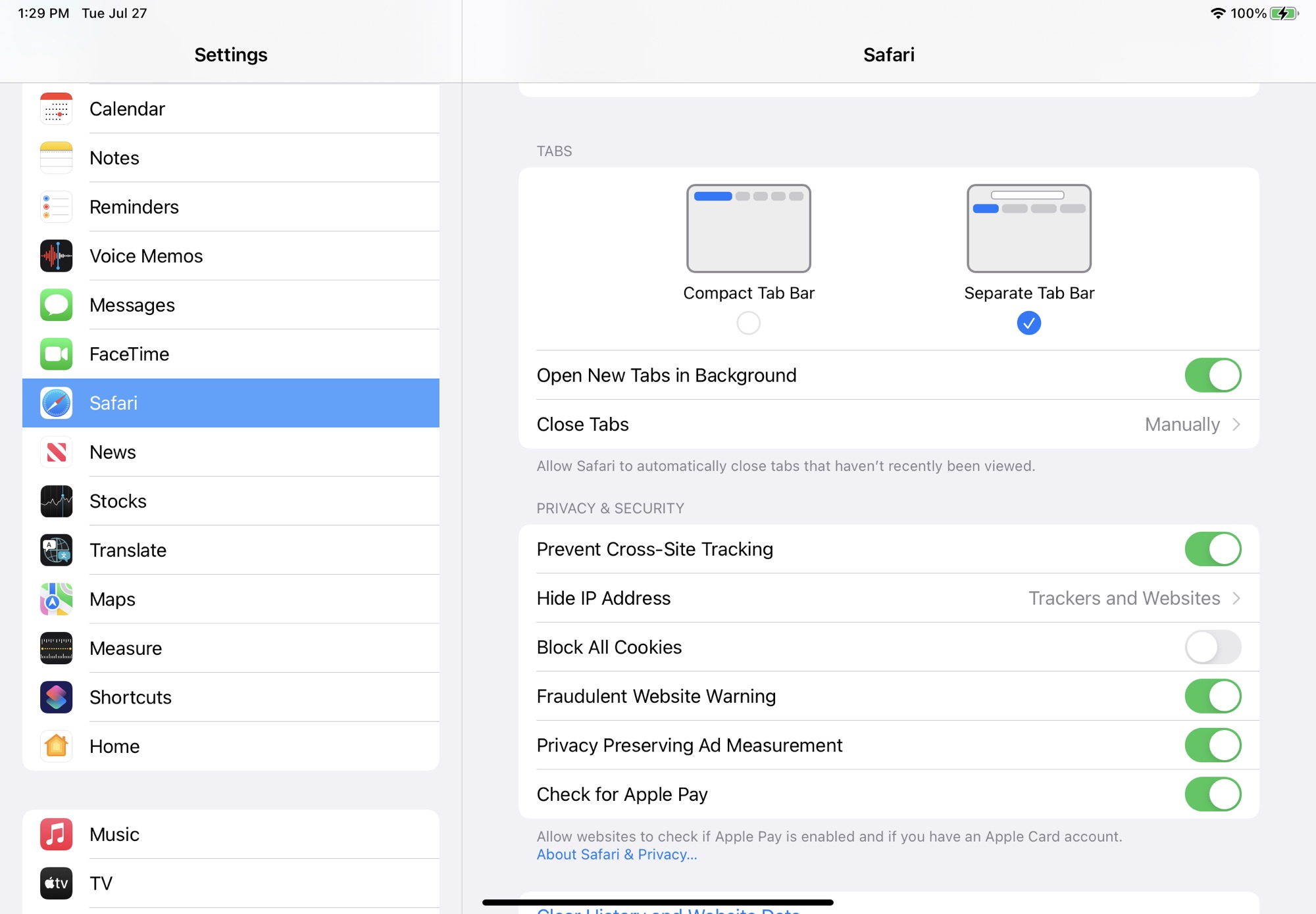
iPadOS 15 Gains macOS Monterey's Redesigned Safari Tab InterfaceThe
fourth beta of iPadOS 15 that was released today introduces tweaks to Safari, with the Safari layout now mirroring the updated layout that was introduced in
macOS Monterey Beta 3.
 <div class="center-wrap">The new Safari design in iPadOS 15 beta 4</div>
Prior to this beta, Safari on
iPad was similar to Safari on iOS with no dedicated tab bar, but after the update, Apple has added a dedicated tab bar that's activated by default, which is the same layout that's now used in
macOS Monterey.
 <div class="center-wrap">The original Safari design in ‌iPadOS 15‌ beta 3</div>
While the separate tab bar is enabled automatically when updating, in the Safari section of Settings, there is an option to toggle on the original compact tab bar that merged everything together.
Apple in iOS and ‌iPadOS 15‌ introduced a compact and unified Safari design that did away with the dedicated URL and search interface, instead letting any individual tab be used for navigation input.

This design has not been popular with users, which has led to Apple making some changes during the beta testing period. As of now, Safari on iPadOS mirrors Safari on ‌macOS Monterey‌, though additional design tweaks could come in the future.<div class="linkback">Related Roundups:
iOS 15,
iPadOS 15</div><div class="linkback">Related Forum:
iOS 15</div>
This article, "
iPadOS 15 Gains macOS Monterey's Redesigned Safari Tab Interface" first appeared on
MacRumors.comDiscuss this article in our forums
<div class="feedflare">
<img src="[url]http://feeds.feedburner.com/~ff/MacRumors-Front?d=yIl2AUoC8zA" border="0"></img>[/url]
<img src="[url]http://feeds.feedburner.com/~ff/MacRumors-Front?d=6W8y8wAjSf4" border="0"></img>[/url]
<img src="[url]http://feeds.feedburner.com/~ff/MacRumors-Front?d=qj6IDK7rITs" border="0"></img>[/url]
</div><img src="
http://feeds.feedburner.com/~r/MacRumors-Front/~4/xhV0cs14-RI" height="1" width="1" alt=""/>
Source:
iPadOS 15 Gains macOS Monterey's Redesigned Safari Tab Interface