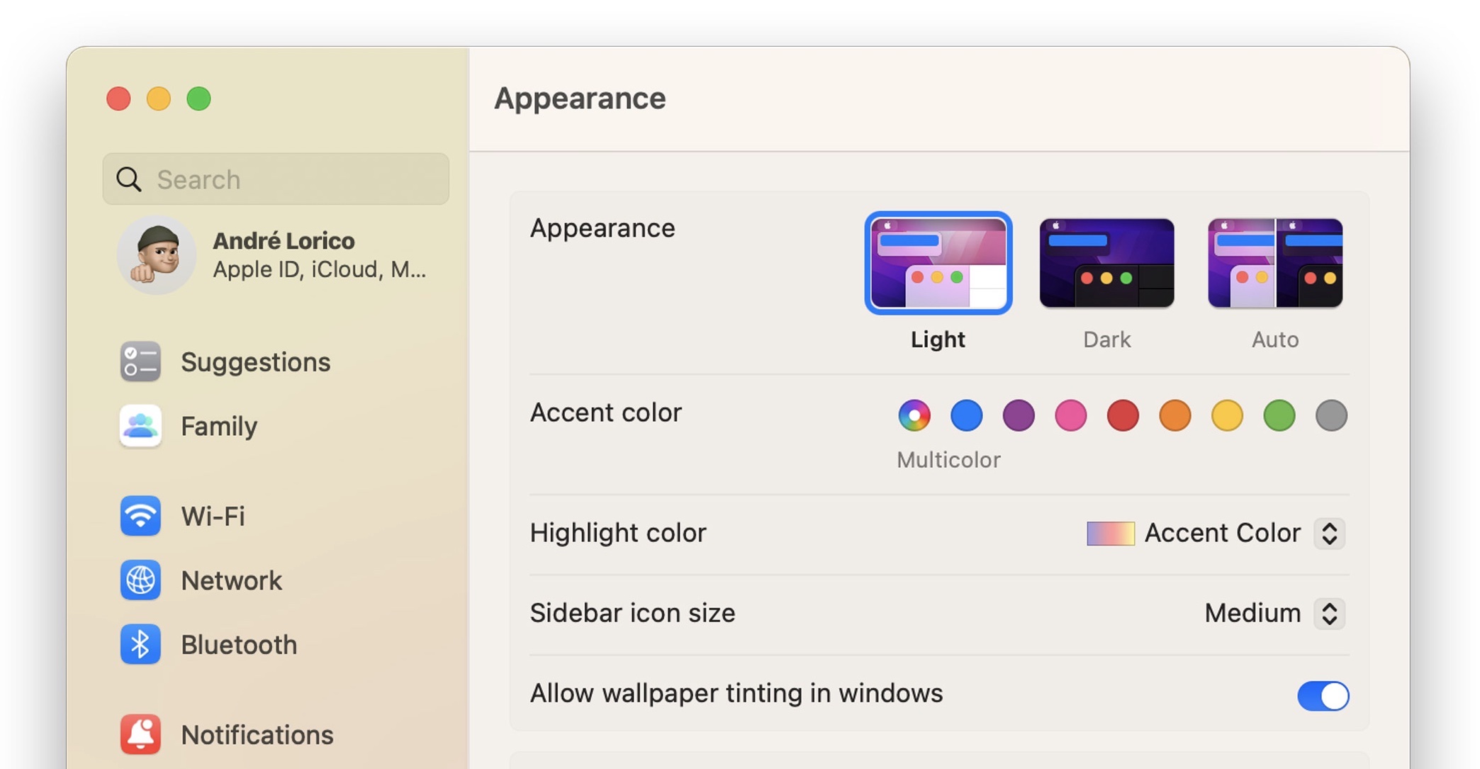
System Settings App in macOS Ventura Beta Still Riddled With UI IssuesIt seems Apple's redesigned macOS Ventura System Settings app, which replaces the System Preferences found in macOS Monterey and earlier versions, is still not without its problems five betas in, as
catalogued by developer Niki Tonsky on Twitter.

For those unfamiliar with it, the new System Settings app looks more akin to the Settings app on the iPhone and iPad than it does to the earlier macOS preferences panels, with settings placed in a sidebar for supposedly easier access.
However, Tonsky's thread highlights several bugs and issues with the interface layout in developer betas 4 and 5 of macOS Ventura, including inconsistent use and erratic behavior of basic UI elements like dropdowns and buttons, misaligned text and poorly sized windows, menu titles that are cut off by menu windows, misplaced content, and more.
The System Settings app is built using SwiftUI, Apple's cross-platform user interface layer that works across iOS, macOS, tvOS, and watchOS. Another complex app written in SwiftUI, Shortcuts, has also
drawn criticism for
similar UI and performance bugs on both macOS and iOS.
<div class="center-wrap"><blockquote class="twitter-tweet"><p lang="en" dir="ltr">Ok thread of weird stuff found in redesigned macOS Ventura System Settings app.
First one: what happens if you simply hold “Up” button
pic.twitter.com/Xuez5U5ufe</p>— Niki Tonsky (@nikitonsky)
August 10, 2022 <script async src="
https://platform.twitter.com/widgets.js" charset="utf-8"></script></div>
Linking to and commenting on Tonsky's tweet thread on his own website,
Daring Fireball's John Gruber said there is "something deeply wrong with SwiftUI that, even while in-progress, so many little layout details are apparently hard to get right."
There are buttons that are halfway cut off by their parent view. When has Apple ever shipped beta software with problems like that? Putting aside the philosophical issue of whether the Mac's system prefs/settings app should follow the basic model of Settings on iOS/iPadOS, no matter what style MacOS's System Settings is supposed to look like, there should be no question that it should look pixel-perfect.
In an interview with Gruber on The Talk Show Live at WWDC 2022, Craig Federighi said that despite what some may think, macOS Ventura's System Settings redesign was not largely inspired by iOS. Federighi insisted that the development team's main goal was consistency for users, and said System Settings on macOS Ventura is a "great interface."
Despite the lingering issues, there's still time for Apple to correct them, as macOS Ventura isn't likely to be scheduled for release until October, or perhaps even early November. Have you had similar experiences interacting with System Settings in the latest beta? What do you think of the new look? Let us know in the comments.<div class="linkback">Related Roundup:
macOS Ventura</div>
This article, "
System Settings App in macOS Ventura Beta Still Riddled With UI Issues" first appeared on
MacRumors.comDiscuss this article in our forums
Source:
System Settings App in macOS Ventura Beta Still Riddled With UI Issues