iPhone 14 Pro hands-on: Don't call it a notch<p>It was a day of farewells today at Apple's
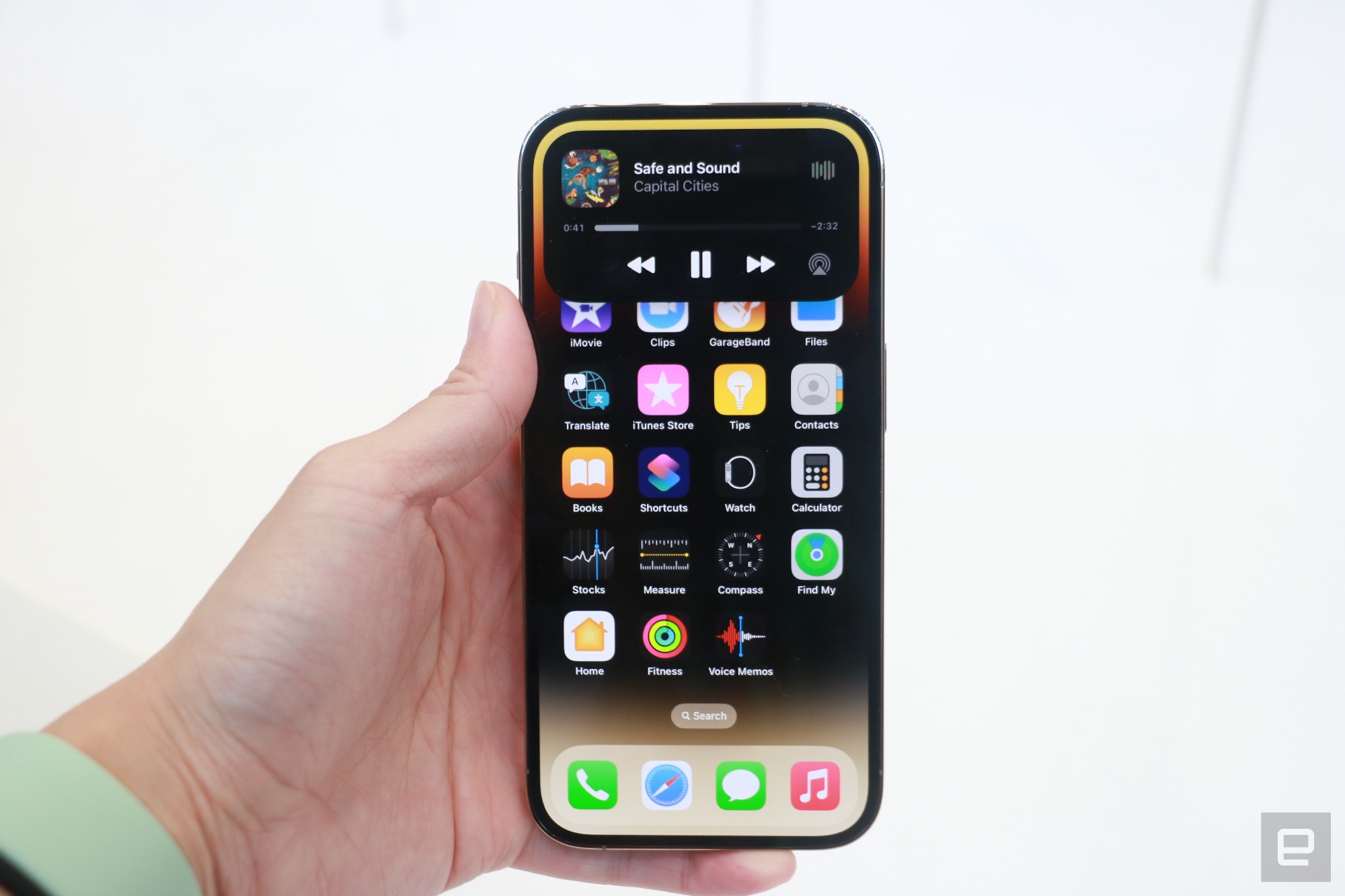
'Far Out' iPhone launch event. In addition to getting rid of the iPhone mini variant, Apple also ditched the notch on the iPhone 14 Pro in favor of a pill-shaped cutout. The company is calling this the "Dynamic Island" at the top of the screen. The iPhone 14 Pro and Pro Max also feature brighter screens and offer an Always On Display so you can always see your most important information. At the Apple event in Cupertino, I spent some time with the new devices and have to say that while the dynamic island still feels very obvious, it also seems a lot more useful.</p><p>The difference is that the interface now makes better use of the space by displaying different information on it. When I started a countdown on the timer app or played a song on Apple Music, the island would show an orange dot to indicate something was happening. Then, when I left the app, the island displayed a waveform to show that my voice recorder was still running, or that music was playing. When I long-pressed the island with one of these activities going on, the box expanded to show more controls. </p><span id="end-legacy-contents"></span><div id="37709cabc46d4241b1d7a1cd6ea595b3"><div style="left:0;width:100%;height:0;position:relative;padding-bottom:56.25%;"><iframe src="
https://www.youtube.com/embed/x6wqalJbfT0?rel=0" style="top:0;left:0;width:100%;height:100%;position:absolute;border:0;" allowfullscreen scrolling="no"></iframe></div></div><p>Apple Music, for example, expanded to show the playback progress bar and buttons for rewind, pause and skip below it. For Timer and Voice Memo, controls appeared for stopping the countdowns and recordings respectively. The software cleverly camouflages the camera hole here, so it never interrupts the content and is hidden with empty black space in that area. Of course, so far, I've just used Apple's own first-party apps on the iPhone 14, and third-party options might not adapt to the island as well.</p><p>When nothing was going on, long-pressing the dynamic island resulted in a slight stretching animation and light haptic feedback. If you peer hard at the pill, you can also see the 12-megapixel TrueDepth camera off to the right under it. Again, it's not quite an all-screen display, but the camera cutout feels better hidden than before.</p><p>Speaking of, the iPhone 14 Pro also got an upgraded camera system, with a new 48-MP primary rear sensor backed by Apple's new Photonic engine for better low light performance. That's not something I could test here at the brightly lit demo space, nor was I able to check out the new Action mode for video stabilization. But there are plenty of improvements to the iPhone 14 Pros on the video and camera front, like Cinematic Mode support for up to 4K resolution and 30fps framerates that we'd have to check out in a full review. </p><figure>

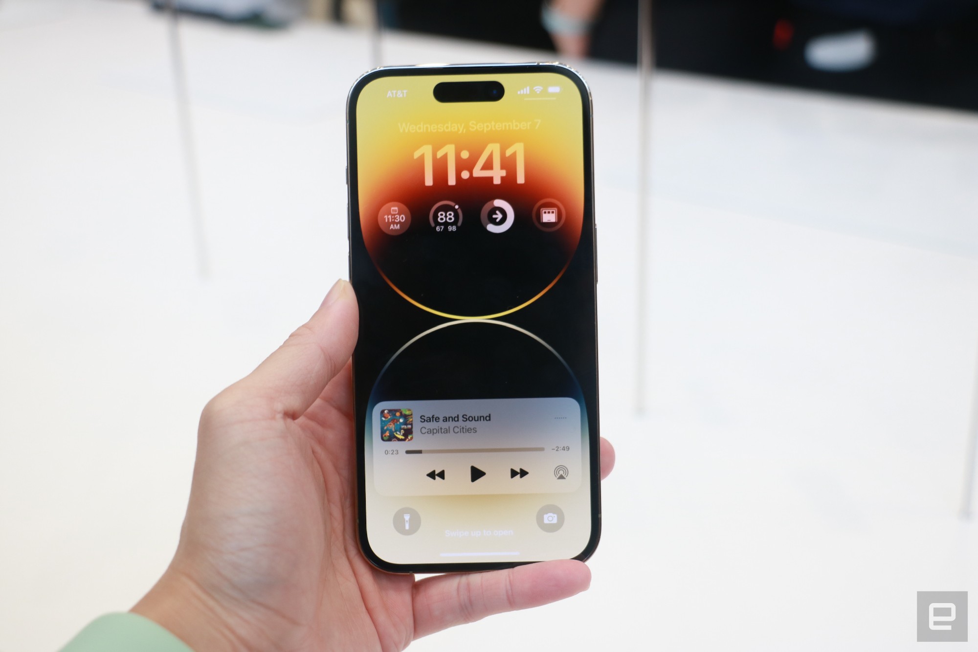
<figcaption></figcaption><div class="photo-credit">Cherlynn Low / Engadget</div></figure><p>Another new feature I was able to briefly try is the Always On Display. When left to sit for awhile, the iPhone 14 Pro dims its screen, but remains just bright enough so you can see your lock screen's contents. When I lifted the iPhone 14 Pro slightly, its display quickly reverted to full brightness, just as responsively as older iPhones wake from sleep. </p><p>Unlike the approach on Samsung or Pixel phones, Apple's version keeps things like your wallpaper and widgets visible in addition to the clock. This might tax the battery a bit more, but the company is still promising all-day endurance for the iPhone 14 Pro series. That might be thanks to the new A16 Bionic Chip, which is built on a 4nm design process that should be more energy efficient. But it's something that again, we'll have to wait till we can test for ourselves to verify. </p><p>There was quite a bit more that I couldn't properly check out here at the Apple event, including the company's new Emergency SOS and Crash Detection features. And though the Pro and Pro Max's respective 6.1-inch and 6.7-inch screens were plenty bright, it wasn't easy to determine if the new phones' displays were indeed brighter than their predecessors. </p><figure>

<figcaption></figcaption><div class="photo-credit">Cherlynn Low / Engadget</div></figure><p>If you're already overdue an upgrade or can't want to make sure you get one next week, you can pre-order the iPhone 14 Pros on September 9th. Those who can should wait till we can perform a full review, and the phones will be available from September 16th starting at $999 for the Pro and $1,099 for the Max. </p><p>
This story is developing, please refresh for updates.</p><p>
Follow all of the news from Apple’s iPhone event right here.</p>
Source:
iPhone 14 Pro hands-on: Don't call it a notch