iOS 18: 10 New Home Screen and Lock Screen FeaturesWith
iOS 18, Apple overhauled the
Home Screen, introducing design changes that allow for more customization and personalization. You can put icons where you want, change their size, and give them new colors, plus you can hide apps and swap out your Lock Screen buttons.
This guide highlights everything new coming to the ‌iOS 18‌ ‌Home Screen‌ and Lock Screen.
<h2 id="rearranging_icons">Rearranging Icons</h2>
With ‌iOS 18‌, you can rearrange app icons and widgets on your ‌Home Screen‌ and app pages with space between them, providing a wealth of new layout options.
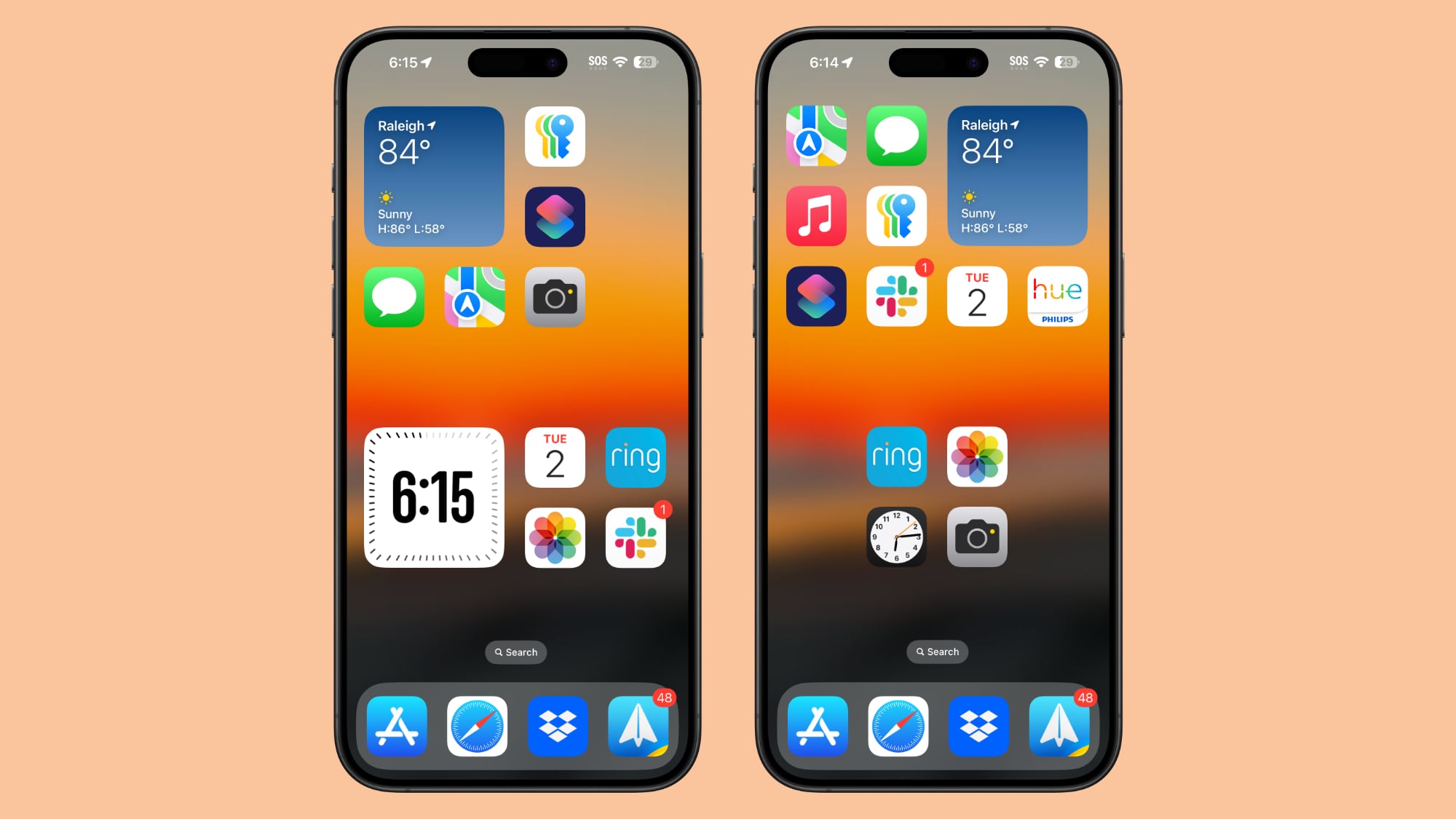
Apple stuck with a grid system so you can only move app icons within the grid locations, but an icon can be placed anywhere in the grid with empty space around it. That sounds complicated, but with
iOS 17, if you added a new app to your ‌Home Screen‌, it would automatically go to the next open spot.
In ‌iOS 18‌, you can choose where to put it. You can have app icon-sized spaces between apps, full empty rows, and full empty columns. You can't put icons and widgets in places with uneven spacing because of the invisible grid limitation, so keep that in mind.
You can put a single app in the middle of a page, have a row of apps at the top and a row of apps at the bottom, create a column of apps, and more. Apple created this design to allow you to place apps and widgets around wallpapers and arrange them into more useful layouts.
Here's how to move your icons:
<ol>
<li>Long press on the ‌Home Screen‌ or on an app page to initiate wiggle mode.</li>
<li>Move apps into the desired positions.</li>
<li>Tap on done.</li>
</ol>
<h2 id="increase_icon_size">Increase Icon Size</h2>
You can make your app icons bigger in ‌iOS 18‌ by removing the app names. With app names in place, Apple needs space to display them, but removing them opens up a lot of area for a larger icon and folder size. Changing the app size does not change the number of apps that are visible, it simply removes text and uses up that empty space.
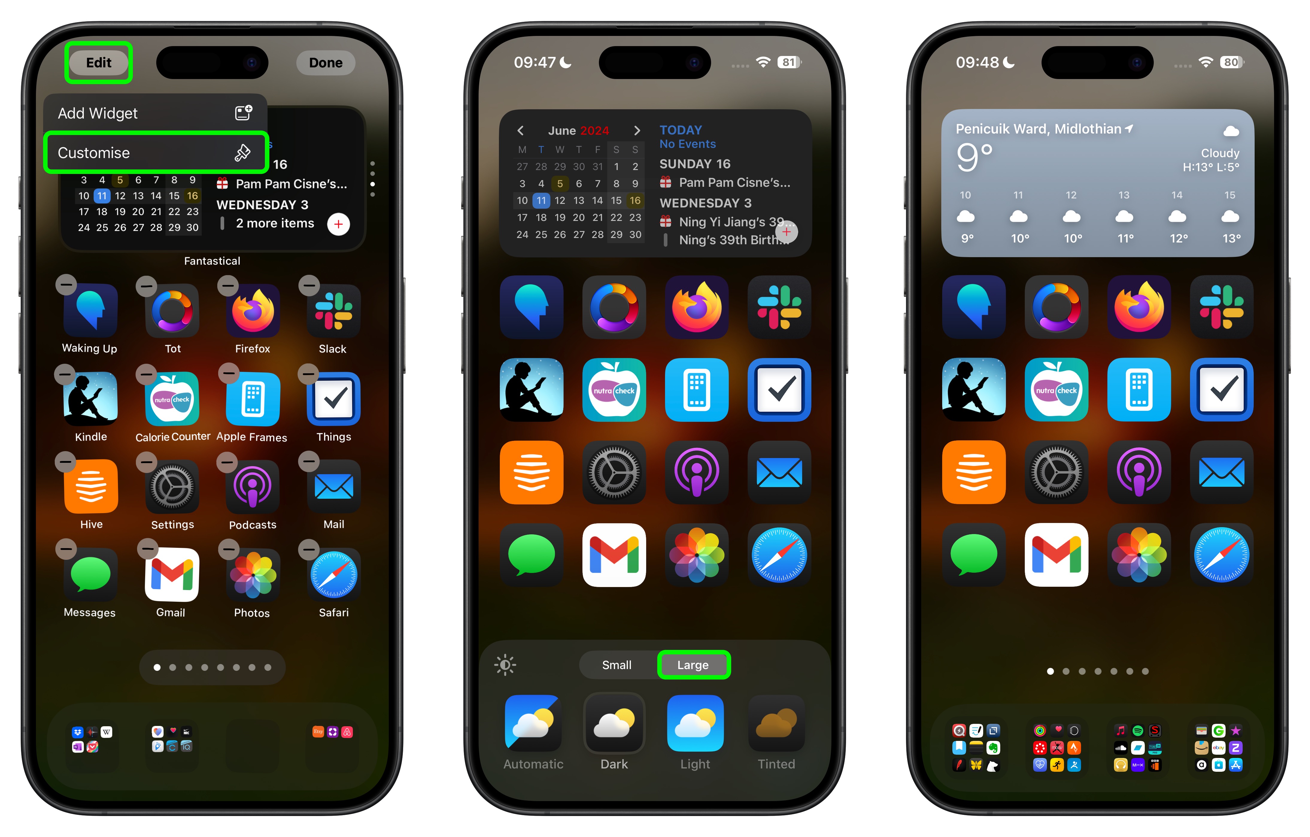
With larger icons, you still get a maximum of six icon rows with four icons each, the same that you're limited to when icon names are turned on. To change icon size, follow these steps:
<ol>
<li>Long press on the ‌Home Screen‌ or an app page.</li>
<li>Tap on "Edit."</li>
<li>Tap on "Customize."</li>
<li>Choose Small to turn on app names, or Large to turn them off.</li>
</ol>
Note that this setting is universal, so you cannot have small icons on one app page and large icons on a different app page.
<h2 id="change_widget_size">Change Widget Size</h2>
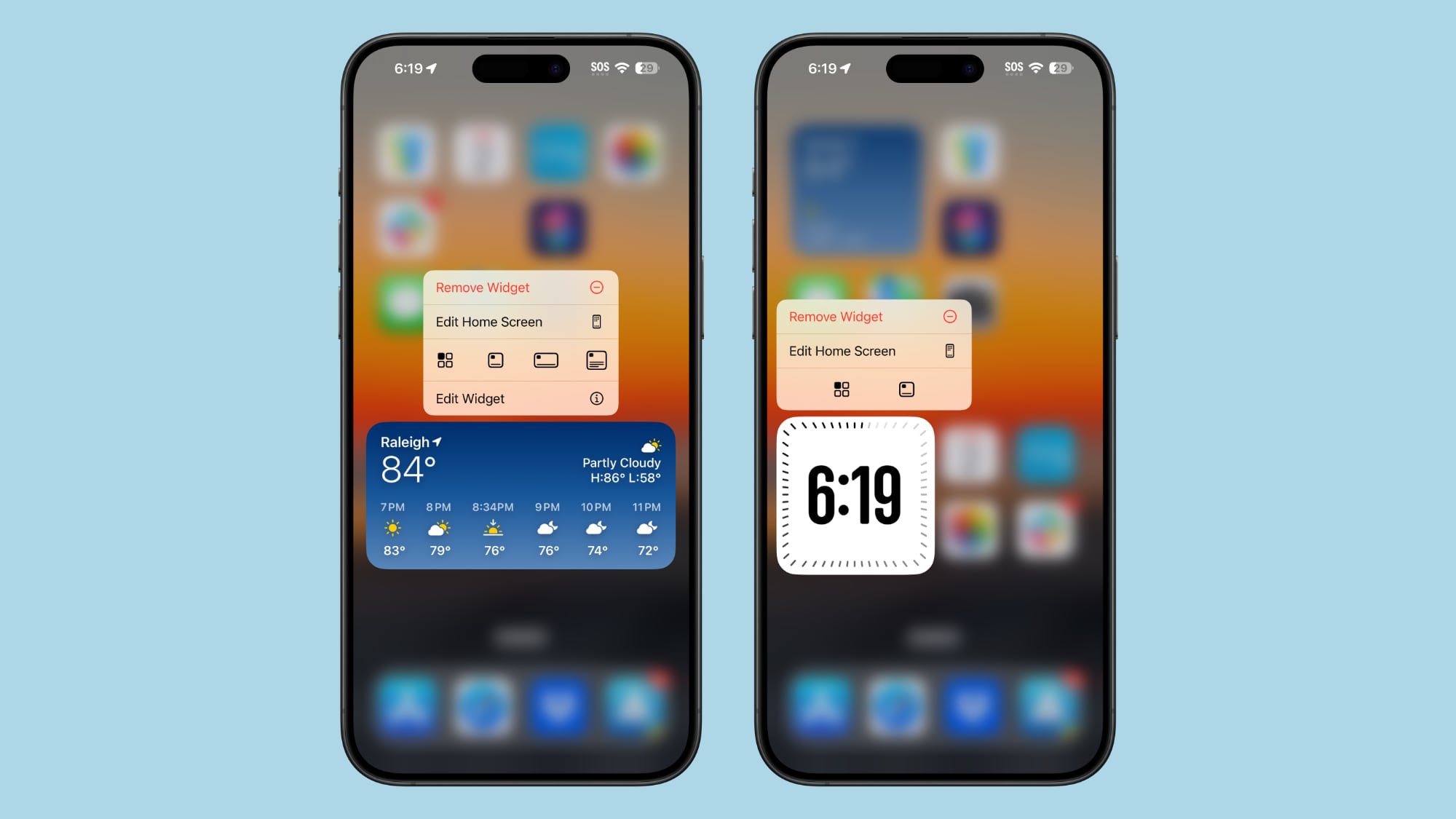
You can change the size of widgets directly from the ‌Home Screen‌ without having to go into the customization options.
Widgets now have a white rounded bar in the corner, which you can drag to make them larger or smaller.
<ol>
<li>Long press on the ‌Home Screen‌ or an app page to get into wiggle mode.</li>
<li>Use a finger to resize the widget to be smaller or larger.</li>
</ol>
You are limited to the minimum and maximum size available with any given widget. For example, the Battery widget can be the size of four app icons, six horizontal app icons in two rows, or a square shape that's four icons wide by four icons tall. When you resize the Battery widget, you are limited to those size options, but you don't need to go into the full widget settings to change the size.
‌Widgets‌ are still added to your ‌Home Screen‌ and app pages in the same way, though some of the labeling has shifted. Long press and tap on "Edit," then choose the "Add Widget" option. It's one more tap than it was before due to the new customization options.
If an app has a widget, you can also long press on its icon to see widget options right there, turning the app's icon into a widget instead.
<h2 id="new_widgets">New Widgets</h2>
Apple added a new Health widget in ‌iOS 18‌ that shows information from the new Vitals feature that's both in the Health app and on Apple Watch. It provides an overview of daily vitals or weekly vitals, plus there's also a new widget for cycle tracking.
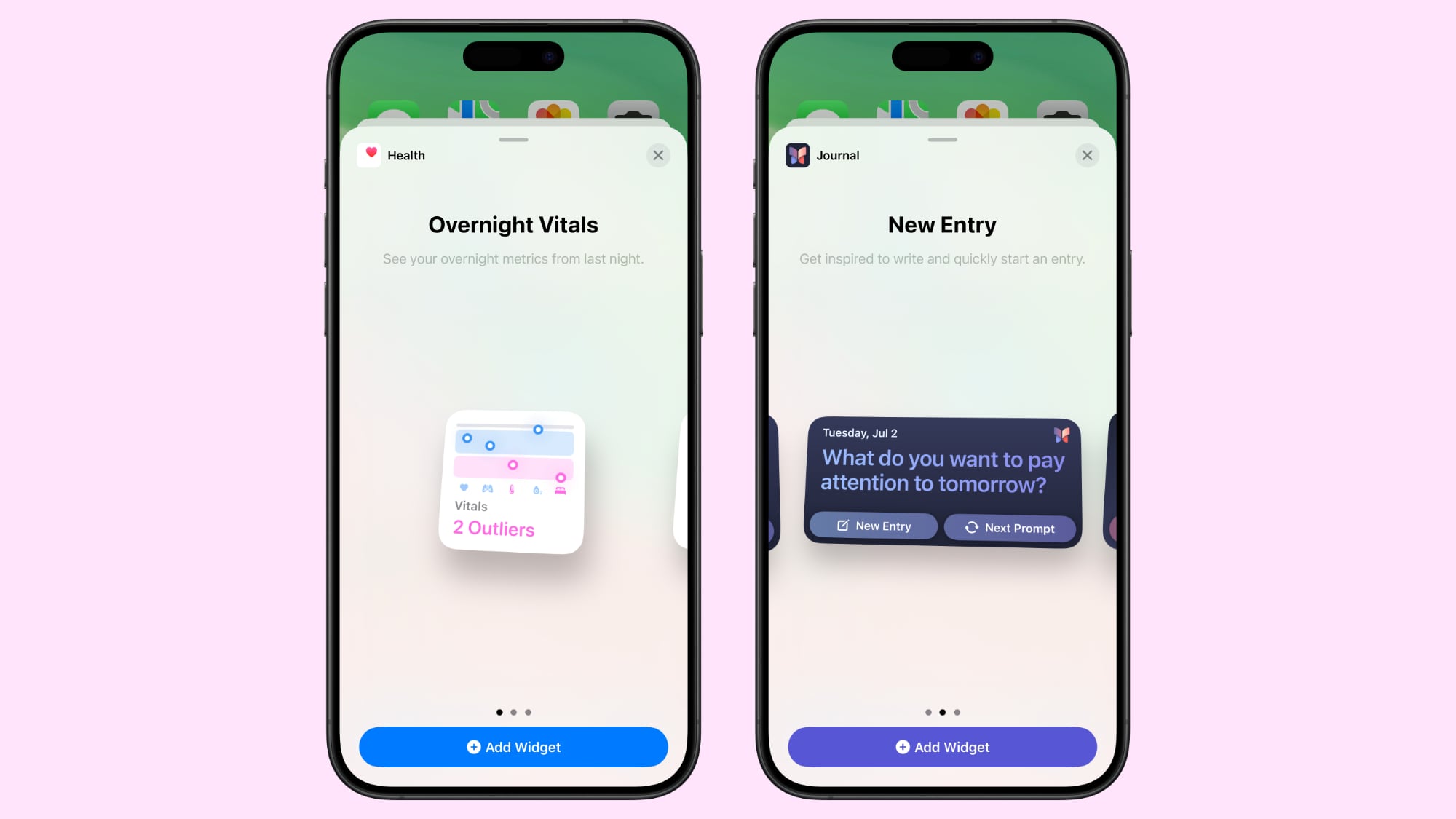
Vitals aggregates information from the Apple Watch to provide a daily readout of how your heart rate, sleep patterns, respiration, and blood oxygen change from day to day and week to week.
There is a new Journal widget as well, with options that provide a writing prompt that you can tap on to open up the app to answer. You can also select a Streaks widget that keeps track of how many days in a row you've used the Journal app.
For the new Training Load feature on Apple Watch, Apple has added a corresponding widget in the Fitness widget section.
In the Home widget section, there are new widgets for electricity usage and electricity rates (a feature coming to select users in ‌iOS 18‌ later this year).
<h2 id="dark_mode_icons">Dark Mode Icons</h2>
Apple's built-in apps have both Light and Dark color options in ‌iOS 18‌, which allows you to change the color of your icons when you have
Dark Mode turned on. The Dark icons are all redesigned with a black background rather than a white or colored background, which makes them blend in better with the ‌Dark Mode‌ setting.
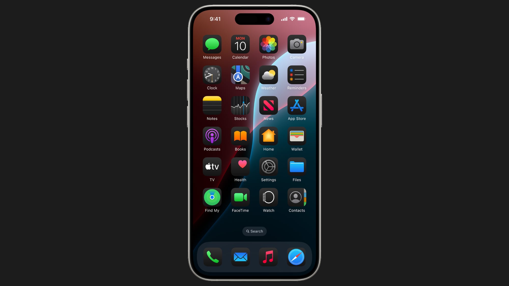
You can turn on Dark icons independently of having ‌Dark Mode‌ enabled, so you can leave Light mode on while using the Dark icon option. You can also set icons to an automatic mode, which means they'll change color depending on whether ‌Dark Mode‌ or Light Mode is active.
Right now, it's only Apple's apps that have a Dark option, but third-party developers will presumably also be able to include two color options for their icons when ‌iOS 18‌ launches.
To go along with the ‌Dark Mode‌ icons, Apple also introduced a toggle that makes your wallpaper darker. Here's how to change your icon and wallpaper color:
<ol>
<li>Long press on the ‌Home Screen‌ or an app page.</li>
<li>Tap on "Edit."</li>
<li>Tap on "Customize."</li>
<li>Select Automatic, Dark, Light, or Tinted, an option described below. This is also the interface used to change app icon size, and darken your wallpaper (the sun icon).</li>
</ol>
The wallpaper option makes your chosen wallpaper a bit darker in color, dimming bright shades when enabled. Tapping toggles Light and Dark modes, with Light being your standard wallpaper color.
<h2 id="icon_tints">Icon Tints</h2>
In addition to choosing a ‌Dark Mode‌ for your app icons, you can opt to put a tint over all of them, which is an aesthetic that's useful if you want to match a wallpaper.
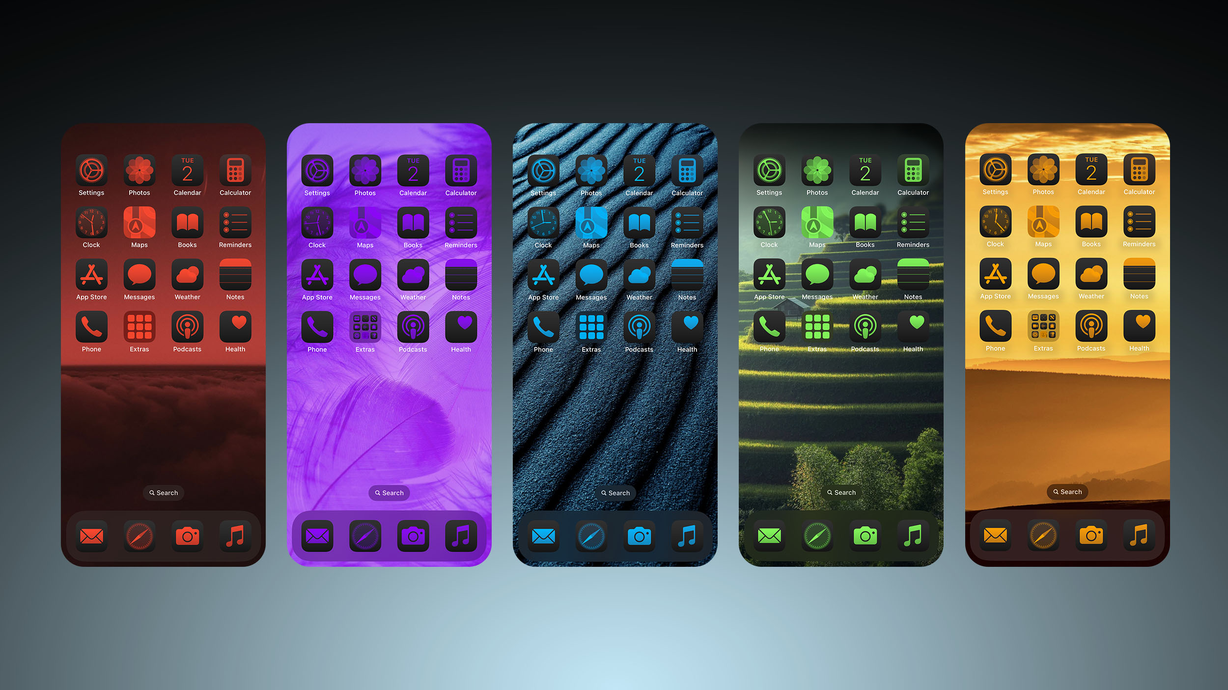
You cannot change icon colors individually, and the tint changes the shade of
all of the icons en masse. You can use an eyedropper to choose a color from your wallpaper, or you can use the two bars to tweak both hue and saturation. Tinting works with all icons because it desaturates and then places a color over the desaturated icon, so you do lose individual colors in app icons and widgets. It's a very monochromatic look.
As with icon size, this is a universal setting so you cannot have different tints for different app pages. Tinting affects not only your app pages and ‌Home Screen‌, but also the App Library. To change an icon tint:
<ol>
<li>Long press on the ‌Home Screen‌ or an app page.</li>
<li>Tap on "Edit."</li>
<li>Tap on "Customize."</li>
<li>Select Tinted and use the sliders to adjust the tint to your ideal color.</li>
</ol>
To turn off a tint, follow these same steps and then choose "Light" or "Dark" to get back to the standard app icon colors.
<h2 id="hiding_and_locking_apps">Hiding and Locking Apps</h2>
‌iOS 18‌ includes a security feature for locking apps or even hiding them entirely from your ‌Home Screen‌ and app pages. A locked app requires a
Face ID or
Touch ID scan to open, so if someone is using your unlocked
iPhone, they still won't be able to open apps you've disabled.
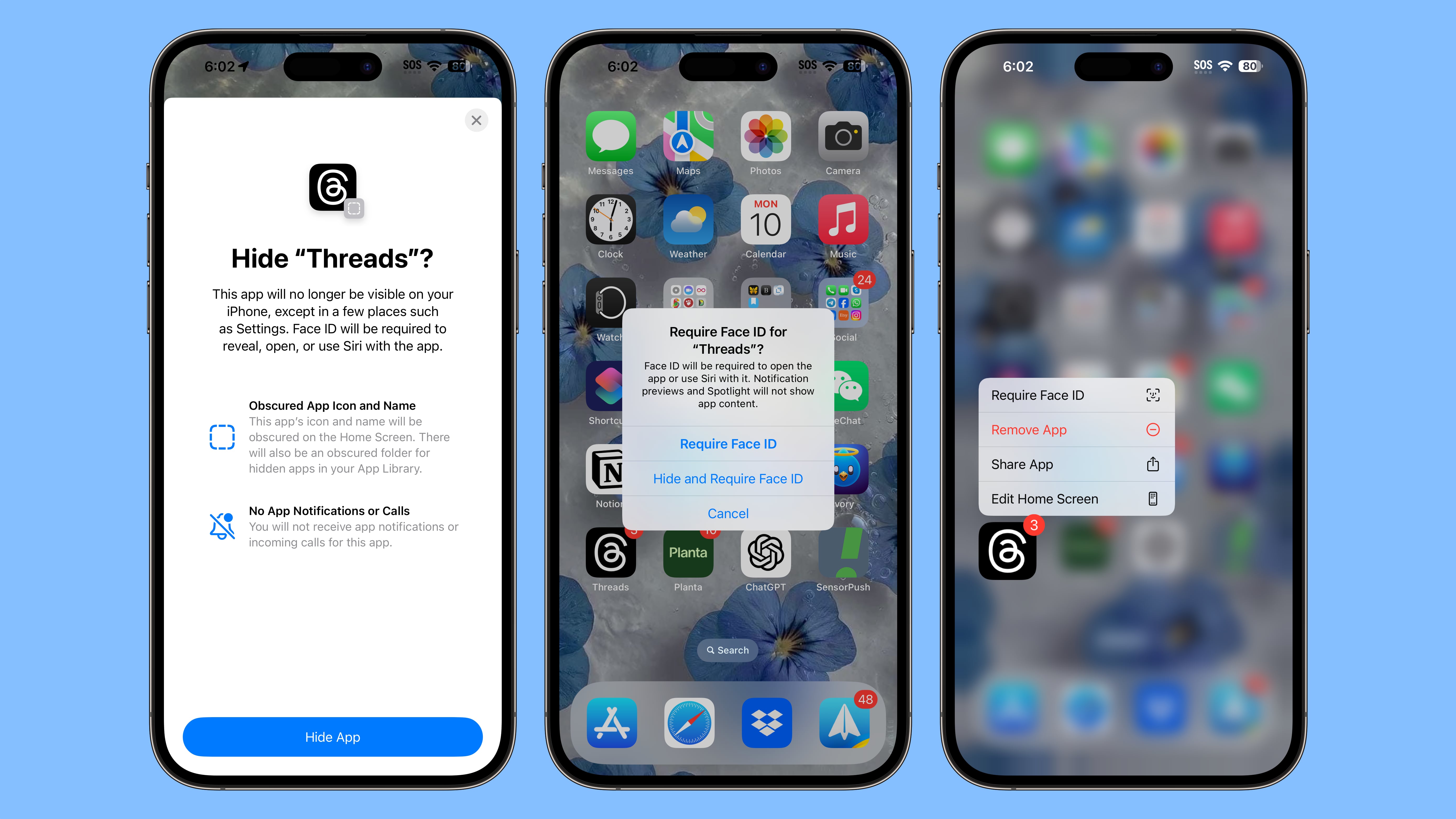
Hiding an app does the same thing as locking it, but goes a step further and removes it from view entirely. You'll only see it in a Hidden folder in the App Library, which also requires authentication to access. Locked and Hidden apps do not show up in searches on the ‌iPhone‌, they're not accessible by
Siri without authentication, and notifications and alerts like calls from the app are disabled, so they're entirely private without authentication.
The option to lock and hide apps is useful for when you need to hand your phone over to someone for viewing photos, playing games, or similar situations.
For a locked app, there is no sign that it's locked until someone attempts to open it, at which point there's a ‌Face ID‌ or ‌Touch ID‌ authentication prompt. For hidden apps, they simply don't show up anywhere except the App Library.
Apps
do show up in your
App Store purchase/download list, but they don't show up in the Settings app. Settings for hidden apps can be accessed in a separate "Hidden Apps" folder that does require authentication to open up. How to lock or hide an app:
<ol>
<li>Long press on the icon of the app that you want to lock or hide.</li>
<li>Tap on "Require ‌Face ID‌."</li>
<li>If you want to simply lock an app, tap on "Require ‌Face ID‌" again. If you want to hide it, choose "Hide and Require ‌Face ID‌."</li>
<li>Authenticate with a ‌Face ID‌ or ‌Touch ID‌ scan.</li>
<li>For a locked app, that's it. For a hidden app, you'll see a screen letting you know that you won't get notifications or calls from the app.</li>
<li>Tap "Hide App."</li>
</ol>
To remove the lock on an app, long press again on the icon on the ‌Home Screen‌ or app page and choose "Don't Require ‌Face ID‌." You will need to authenticate to turn it off.
To unhide an app, go to the App Library, select the Hidden section, authenticate with ‌Face ID‌ or ‌Touch ID‌, long press on the app icon, and choose "Don't Require ‌Face ID‌ or "Unhide App." The first option turns off the lock and keeps the app off of the ‌Home Screen‌, while the second both turns off the authentication requirement and adds it back to the first available opening on an app page.
If you turn off the lock and do not add it back to the ‌Home Screen‌, you'll need to find it in the App Library to put it back on the ‌Home Screen‌ later.
<h2 id="lock_screen_updates">Lock Screen Updates</h2>
Apple didn't make major changes to the Lock Screen because it was just overhauled with ‌iOS 17‌, but there are a few updates worth noting.
<h3 id="rainbow_time_and_other_new_lock_screen_widget_options">Rainbow Time and Other New Lock Screen Widget Options</h3>
With ‌iOS 17‌, Apple added an option to customize the font and the color of the time on the Lock Screen, and in ‌iOS 18‌, there's a new rainbow color option that adds a variegated rainbow shade for the time. There are no other changes to font or color options.
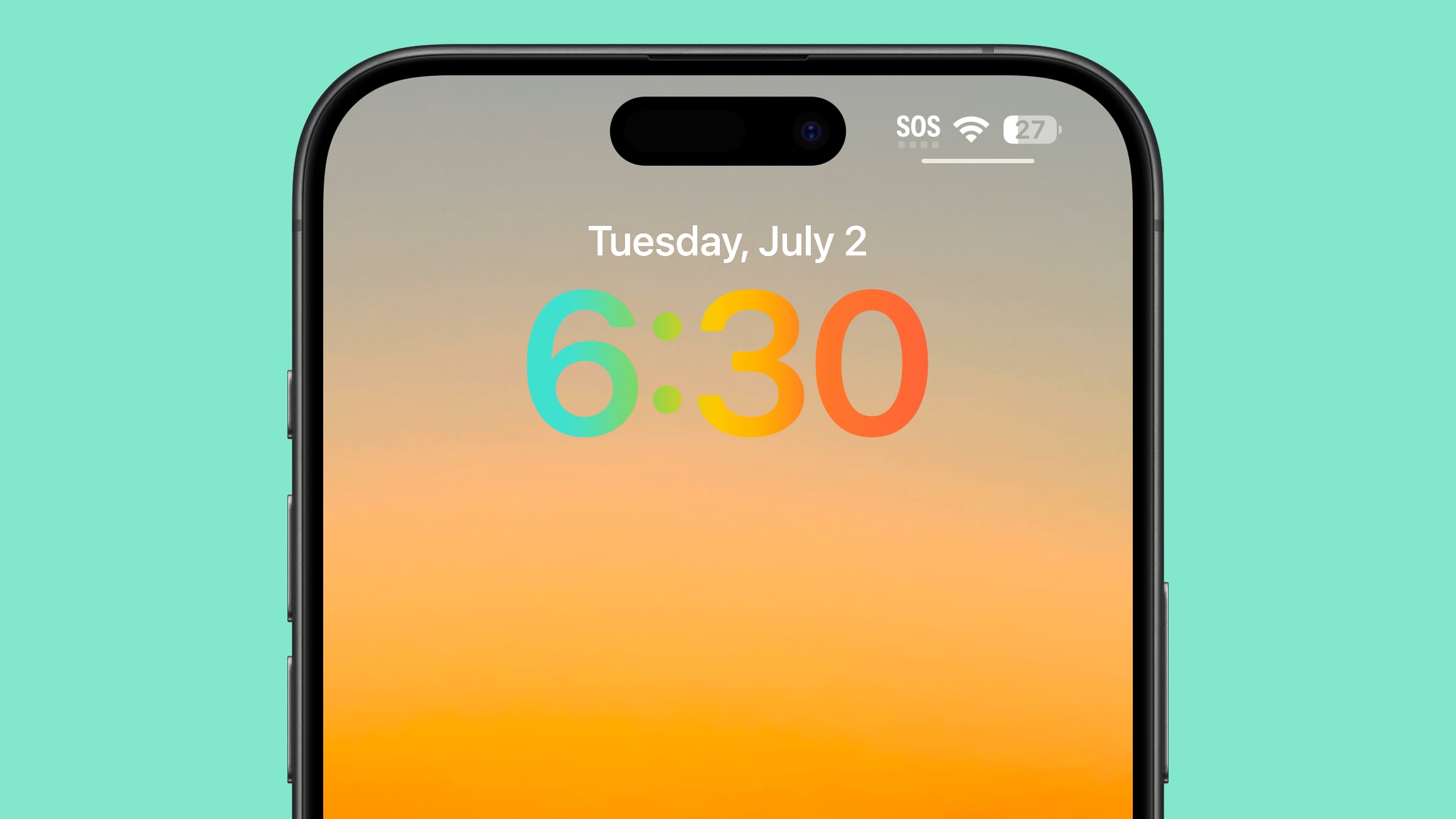
Above the time, you can add a new Journal widget that presents a journaling prompt and opens the app when you tap it.
For widget options, there are new Health app Vitals widgets, and new entries for electricity usage and rates. These match the new ‌Home Screen‌ widgets.
<h3 id="quick_buttons">Quick Buttons</h3>
For the first time, you can change the Flashlight and Camera icons on the Lock Screen, picking something more useful or turning them off entirely.
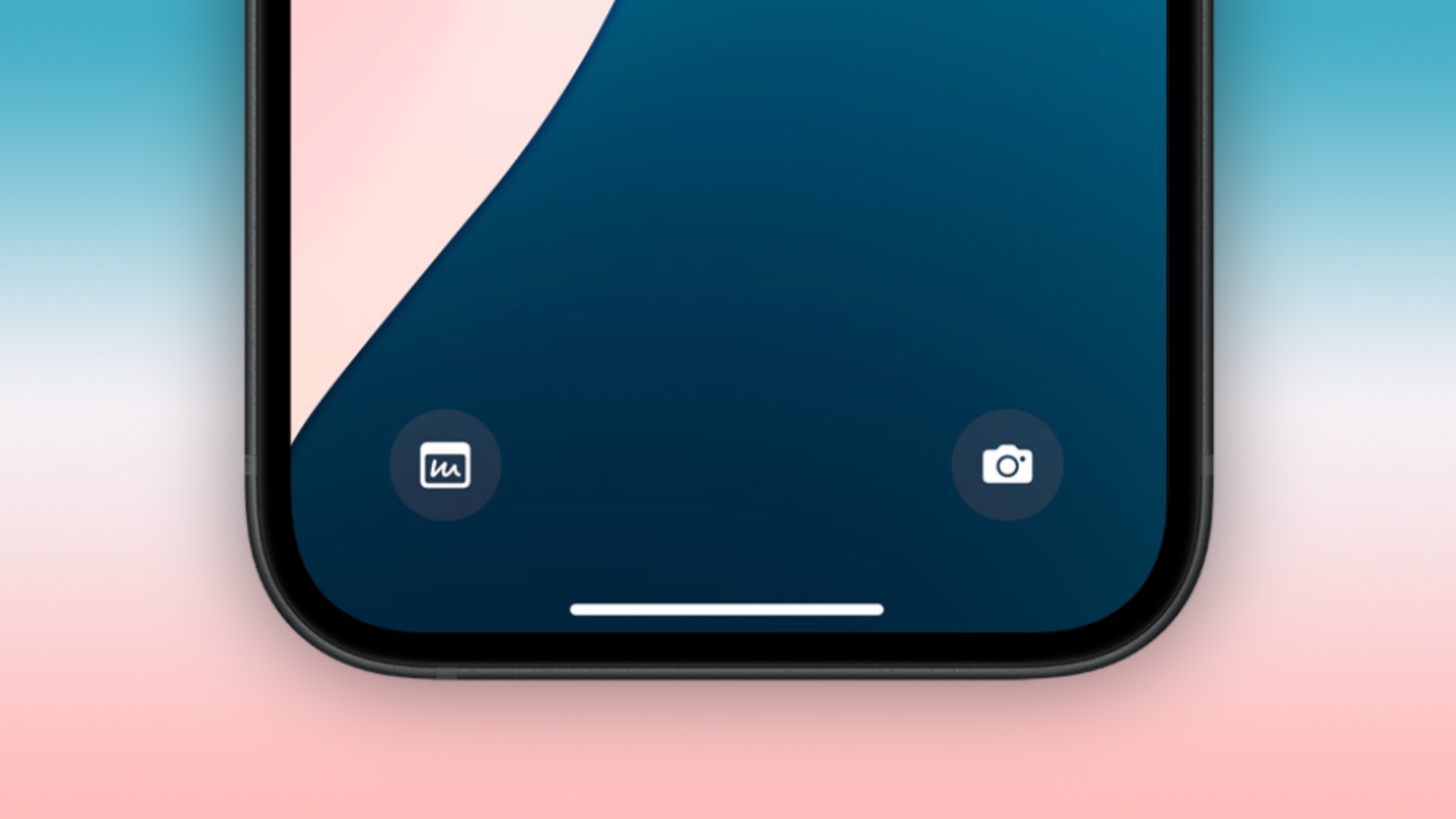
You can choose any Control Center option for the Lock Screen buttons, including Shortcuts, ‌Dark Mode‌, Airplane Mode, Remote, Alarm Calculator, Translate, and more. This change ties into a redesign of the Control Center, and it gives you a lot more possibilities for what you can launch from the Lock Screen.
Apple is allowing third-party apps to add Control Center icons, so you can also choose from those. Depending on what you pick, you may need to use ‌Face ID‌ or ‌Touch ID‌ to authenticate before being able to access an app from the Lock Screen in order to preserve user privacy and keep sensitive data from being easily accessible.
To change your Lock Screen buttons, follow these steps:
<ol>
<li>Long press on the Lock Screen after authenticating.</li>
<li>Tap on Customize.</li>
<li>Tap on Lock Screen.</li>
<li>From this interface, tap on the "-" icon to remove any apps that are already assigned to those buttons. If you're doing this for the first time, you'll have the Flashlight and Camera apps set to the default, which need to be removed.</li>
<li>From there, tap on the "+" button and choose a new control to add.</li>
<li>Tap on Done in the upper right corner.</li>
</ol>
<h3 id="ios_18_wallpaper">iOS 18 Wallpaper</h3>
There are four new ‌iOS 18‌ wallpaper options in pink, yellow, azure, and purple with a matching darker colored swoop. These all have a Light Mode and a ‌Dark Mode‌ shade customized by Apple, with the ‌Dark Mode‌ featuring a background glow for the darker part of the design.
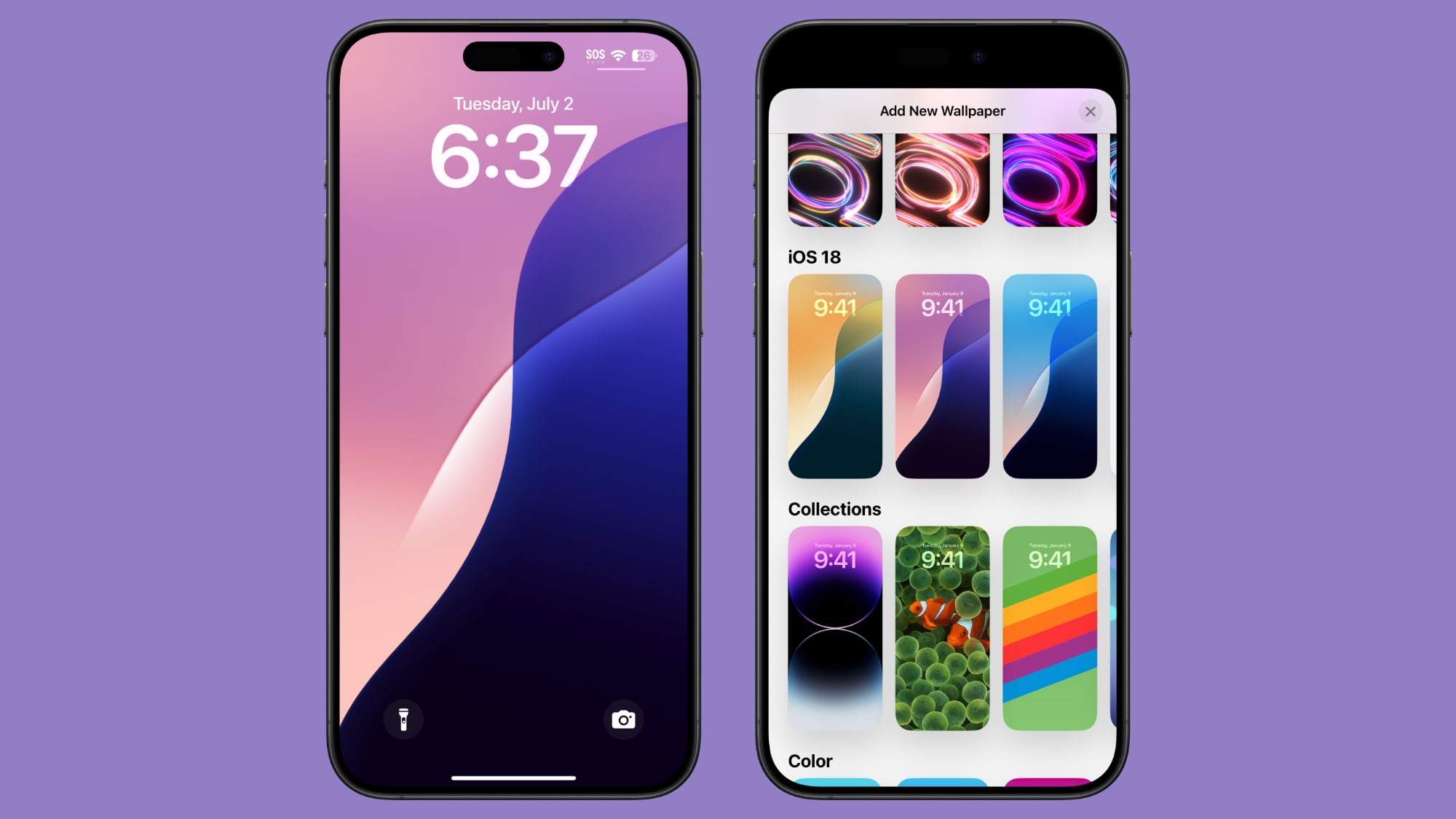
You can find the new wallpapers by long pressing on the Lock Screen, and choosing Customize to modify an existing wallpaper or "+" to add a new one entirely.
<h2 id="read_more">Read More</h2>
More on all of the new features that were added in ‌iOS 18‌
can be found in our iOS 18 roundup.<div class="linkback">Related Roundups:
iOS 18,
iPadOS 18</div><div class="linkback">Related Forums:
iOS 18,
iPadOS 18</div>
This article, "
iOS 18: 10 New Home Screen and Lock Screen Features" first appeared on
MacRumors.comDiscuss this article in our forums
Source:
iOS 18: 10 New Home Screen and Lock Screen Features