macOS Tahoe icons do exactly what Apple said designers should never do<div class="feat-image">
</div><p>macOS Tahoe app icons came under fire late last year with commenters describing them as “terrible” and “objectively bad.” In our poll,
9to5Mac readers had <a href="
https://9to5mac.com/2025/11/10/are-the-macos-26-tahoe-icons-terrible-and-objectively-bad-poll/" target="_blank" rel="noreferrer noopener">exceedingly mixed views[/url].</p>
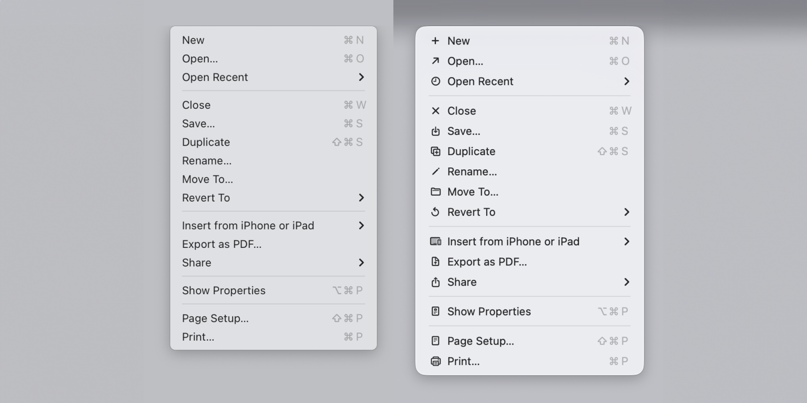
<p>Software engineer Nikita Prokopov has now drawn attention to the icons used within menus and pointed out that they almost exactly mirror the approach which Apple’s <a href="
https://dn721903.ca.archive.org/0/items/apple-hig/Macintosh_HIG_1992.pdf" target="_blank" rel="noreferrer noopener">Macintosh Human Interface Guidelines[/url] advised against back in 1992 … </p>
<a data-layer-pagetype="post" data-layer-postcategory="macos,macos-tahoe,macos-tahoe-26" data-layer-viewtype="unknown" data-post-id="1034202" href="
https://9to5mac.com/2026/01/06/macos-tahoe-icons-do-exactly-what-apple-said-designers-should-never-do/#more-1034202" class="more-link">more�
macOS Tahoe icons do exactly what Apple said designers should never do
